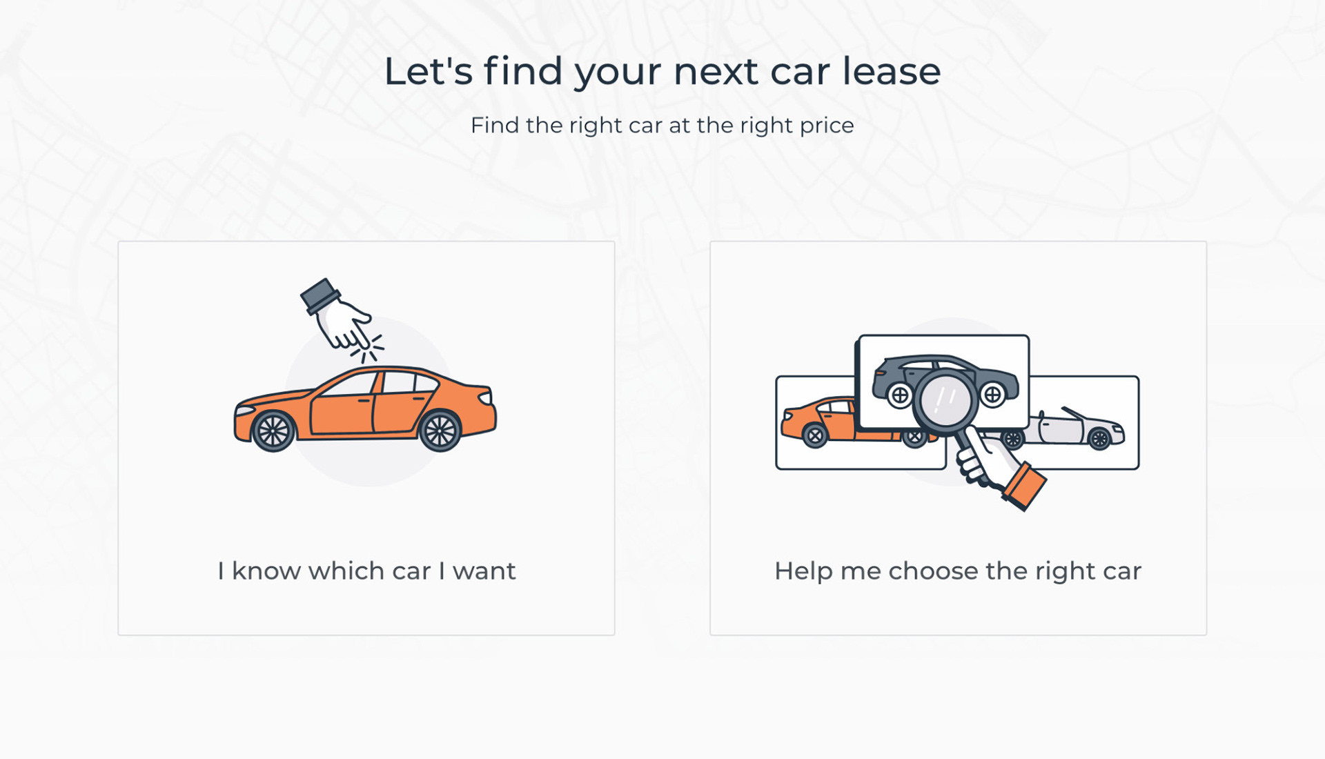
Based in Zurich, GOWAGO AG is a startup that is revolutionizing digital car buying with their new online platform. Their technology enables customers to make an easy and informed decision when leasing their next vehicle online, without any car knowledge, while remaining 100% independent, unbiased and fully transparent in the offerings.
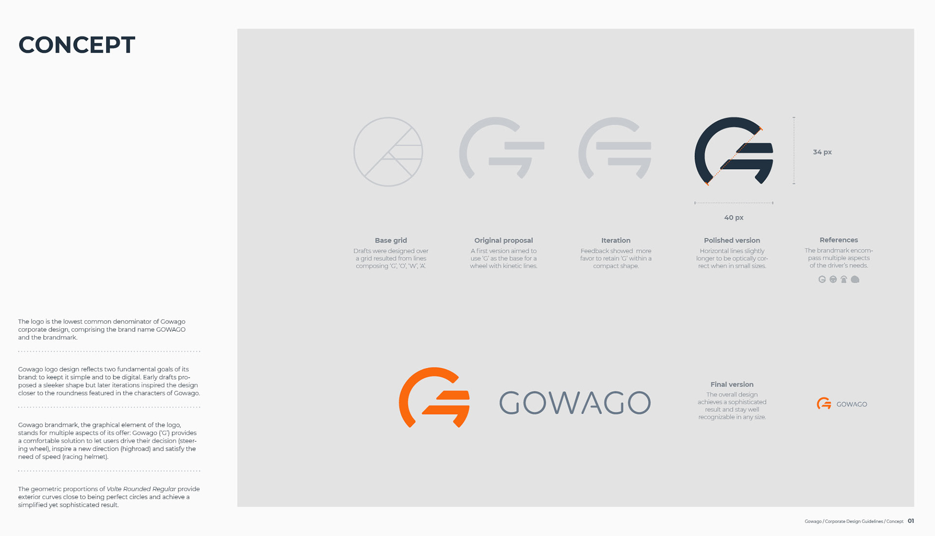
Design of GOWAGO AG logo happened parallel to the development of the platform – it was expected that features would change and goals reevaluated based on iterations and feedbacks. Although the mandate was on point, "design a simple yet sleek logo for our product", the brand story was revisited multiple times along the road. Thus the design process started with a prominent conceptual phase.
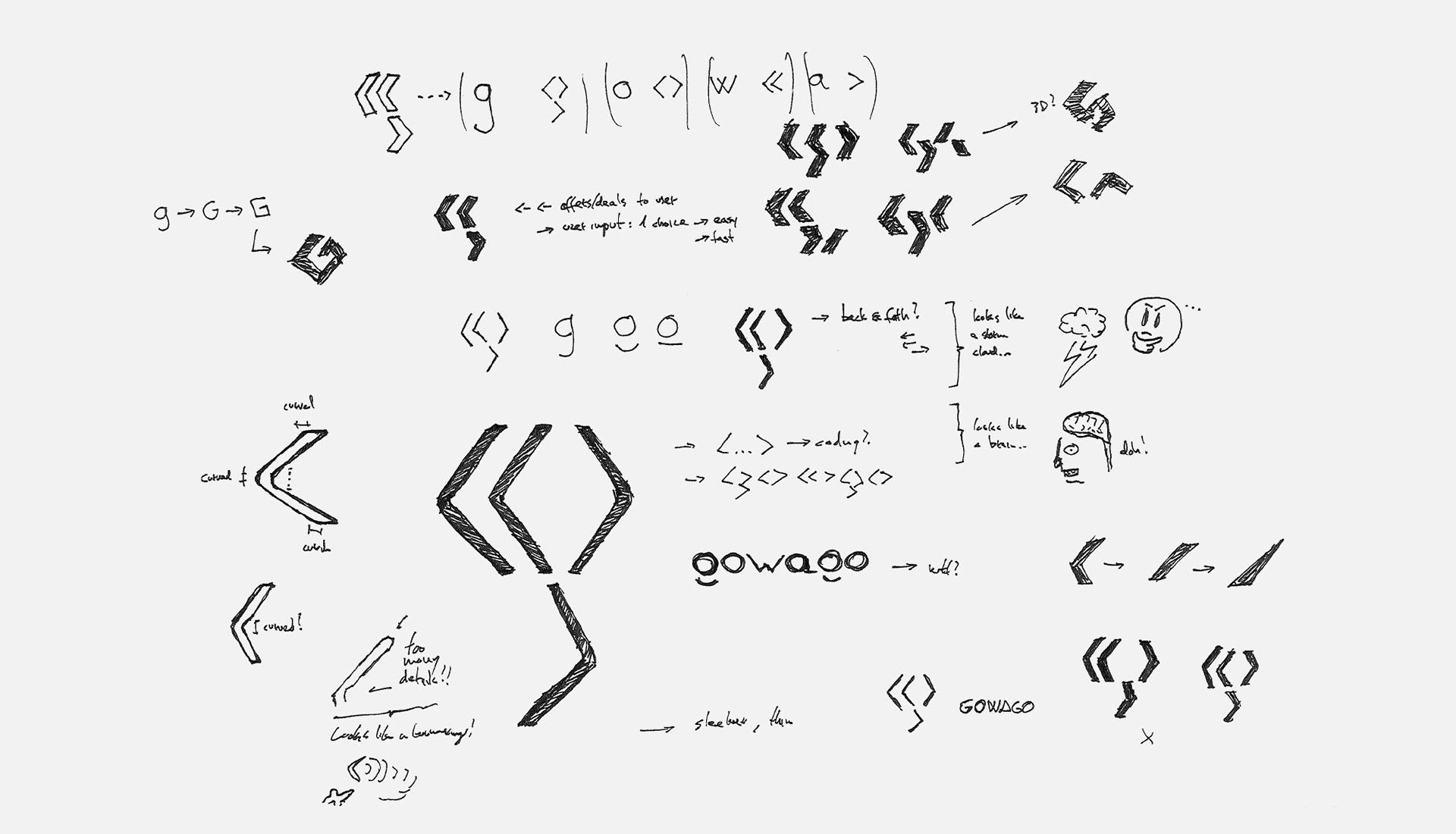
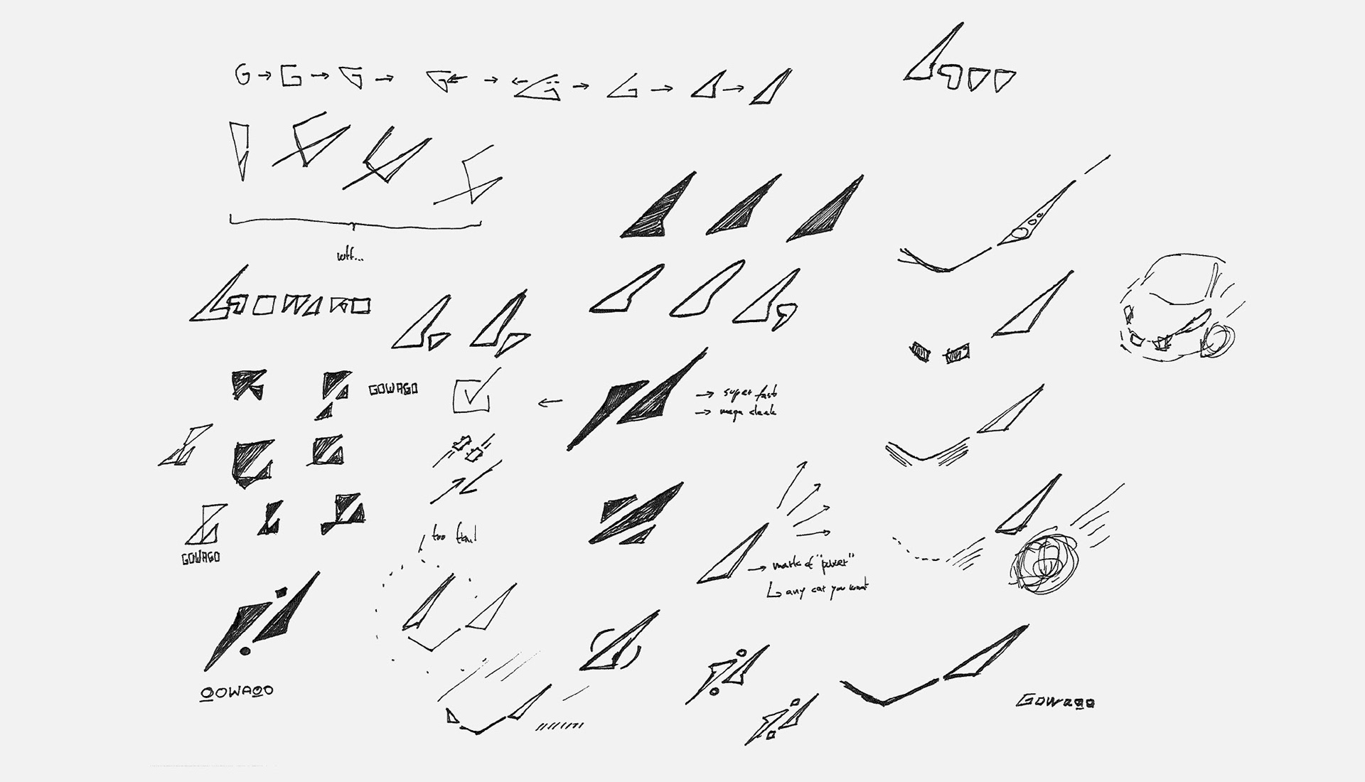
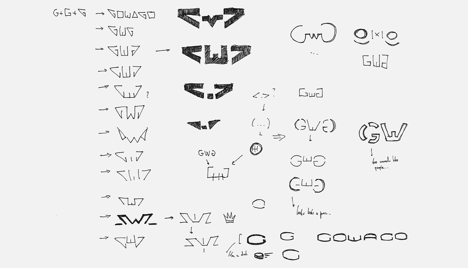
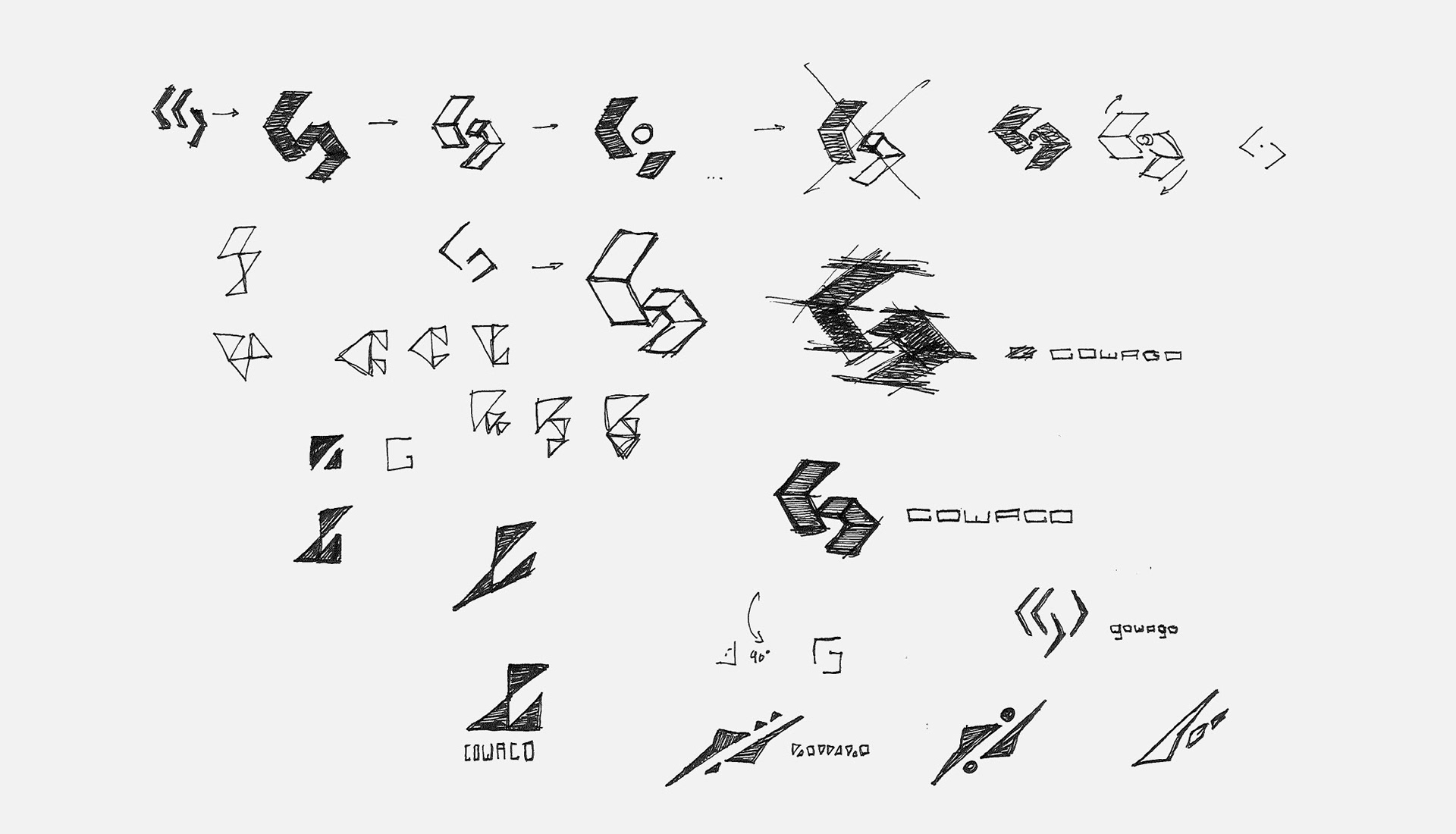
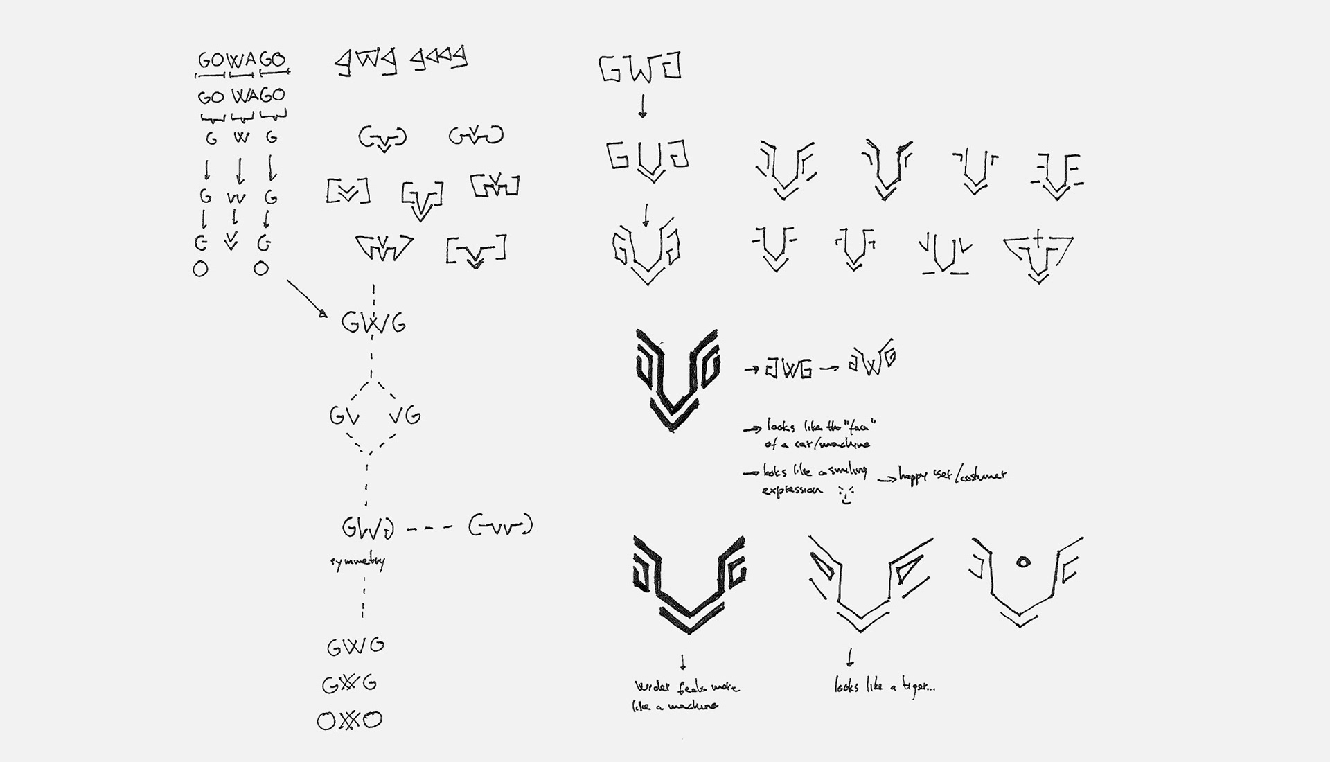
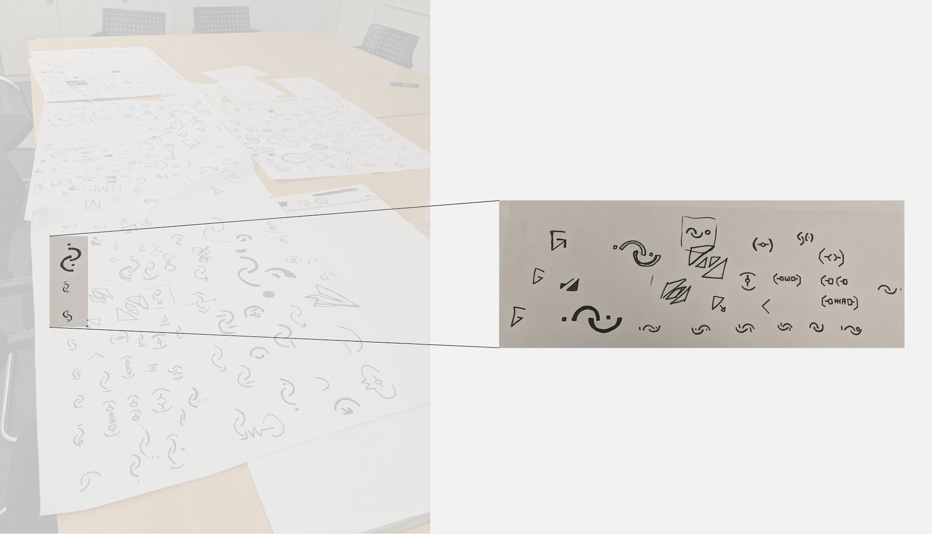
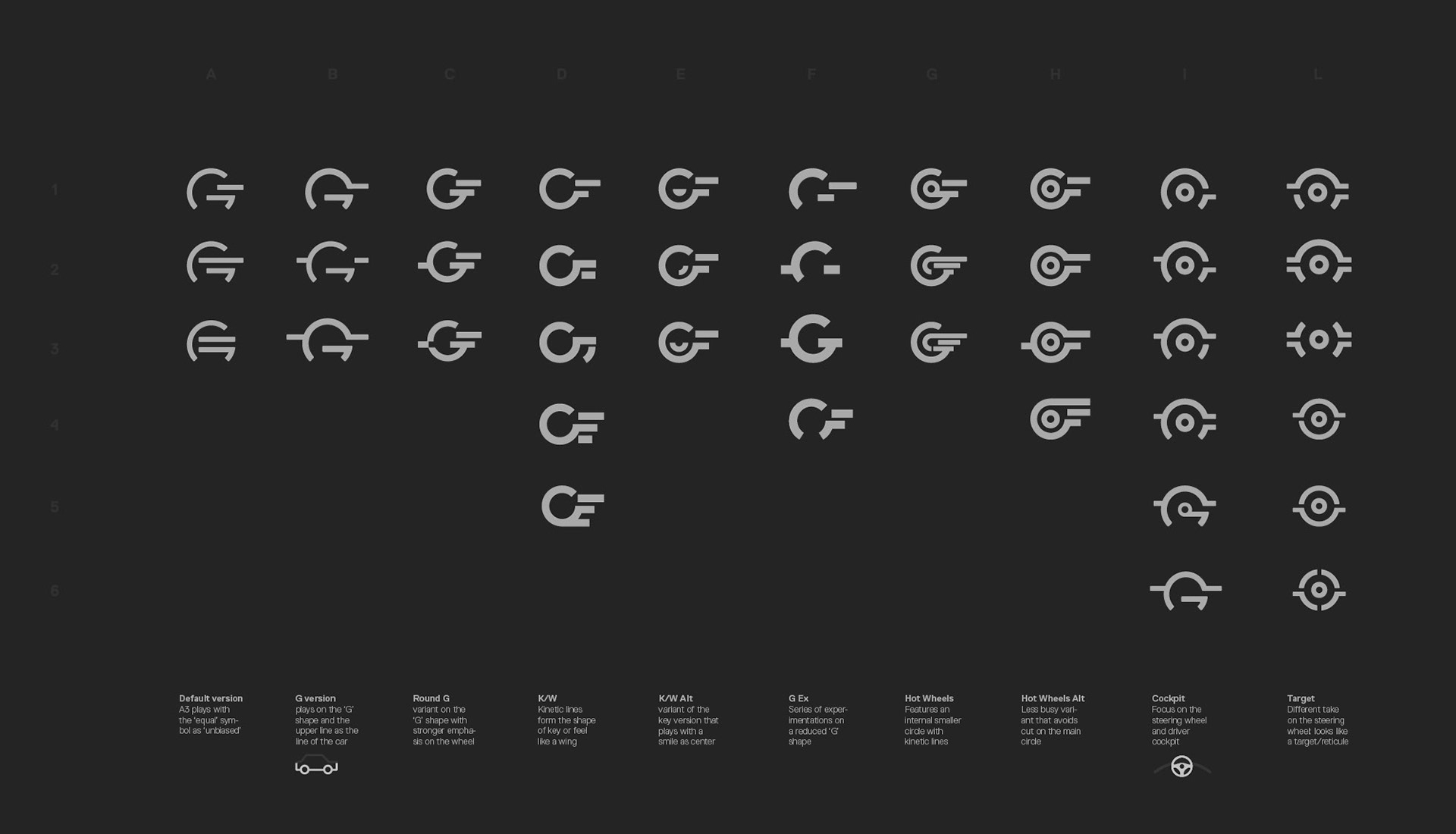
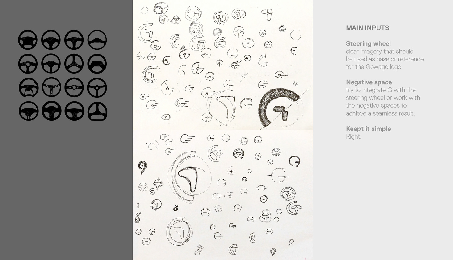
The initial concepts were intentionally quirky and tested various configurations and thinking logics. The common guideline was to have a solid presence with a simple, recognizable and "attractive" silhouette. In order to fulfill the first two requirements, the design was made that it could be hand drawn by everyone (with the idea that you can draw it, you can see it, you can recall it). An initial attempt to define what attractive meant to GOWAGO AG, and how would be that visualised, was to highlight the technology expertise through sharp forms, with no apparent connection to the automative imagery.
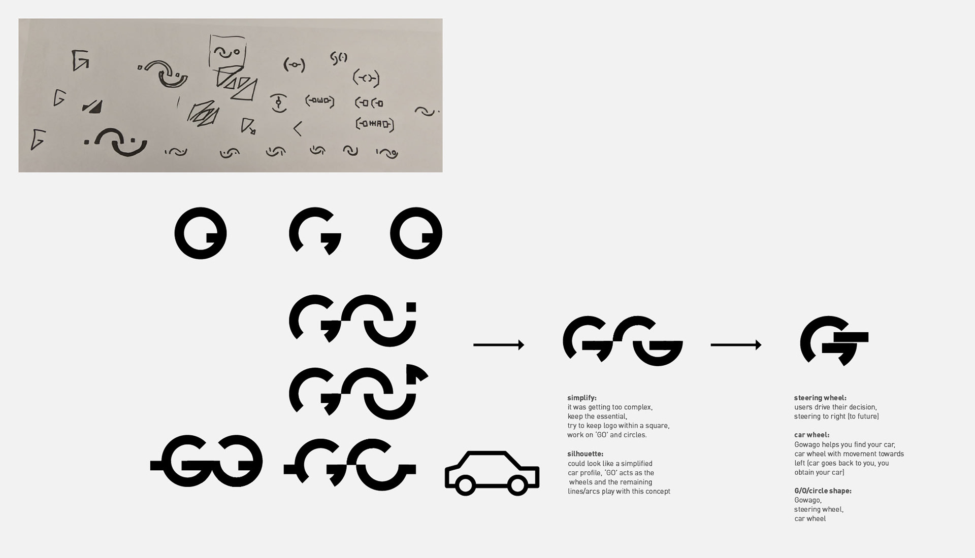
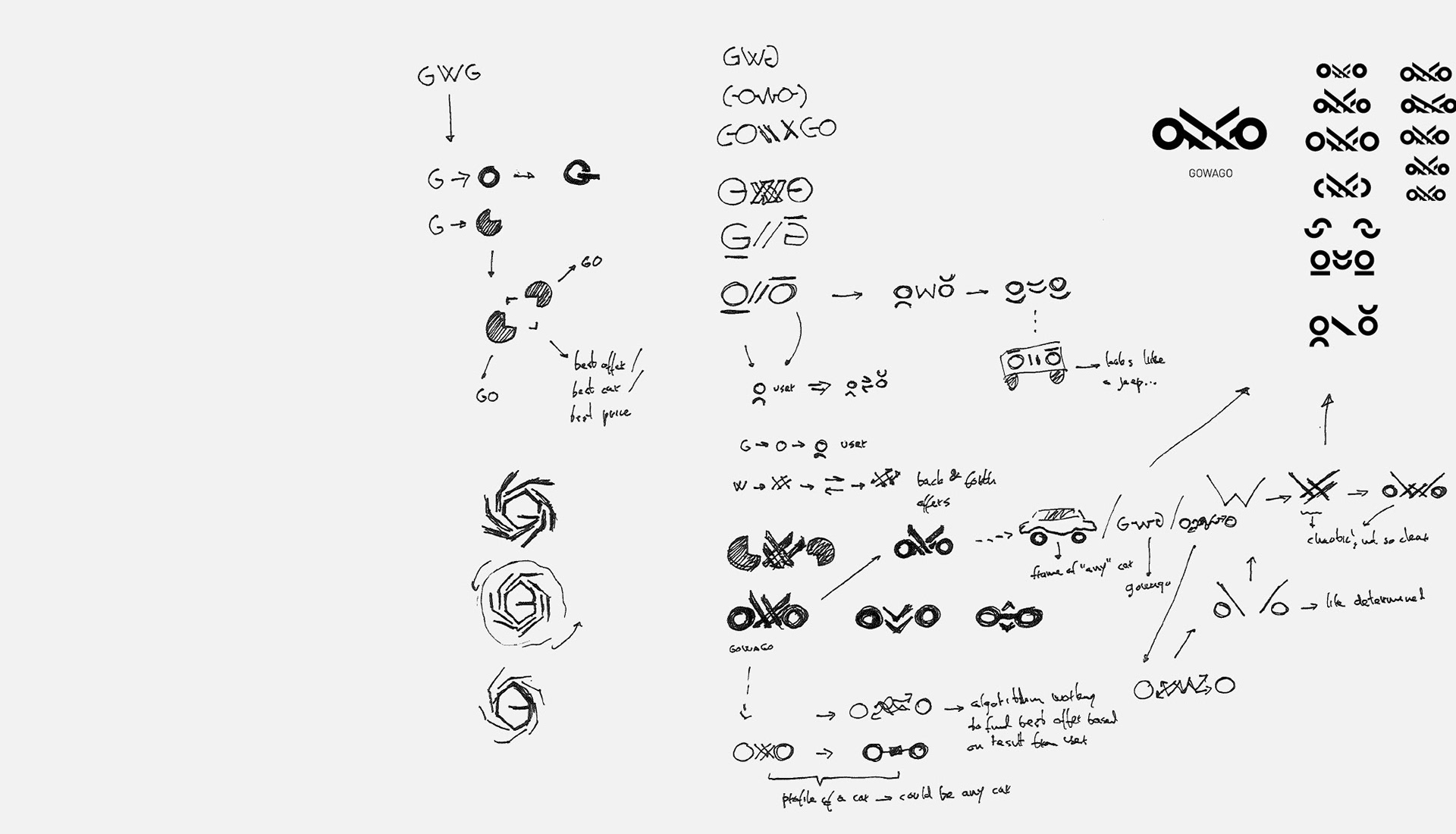
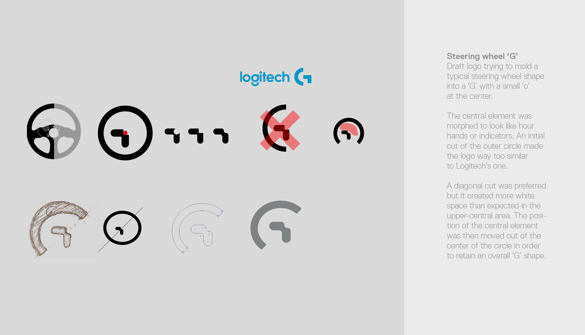
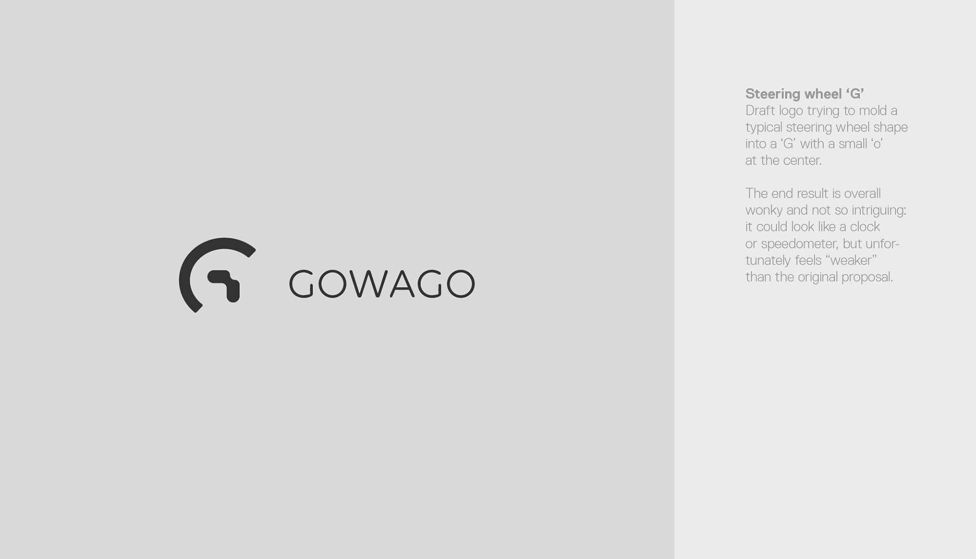
A solution based on circles was later favoured because of the optical attractiveness built around the asymmetry of the circular sections, in a composition between steady and ready to move. The design derived from three main inputs: the steering wheel ("users drive their decision"), the car wheel ("GOWAGO AG helps you find your next car") and the GOWAGO AG name ("the platform"). A horizontal line dictates the direction towards right, towards the future ("the user steers in direction of the future, to their next car"). A first version was then developed.
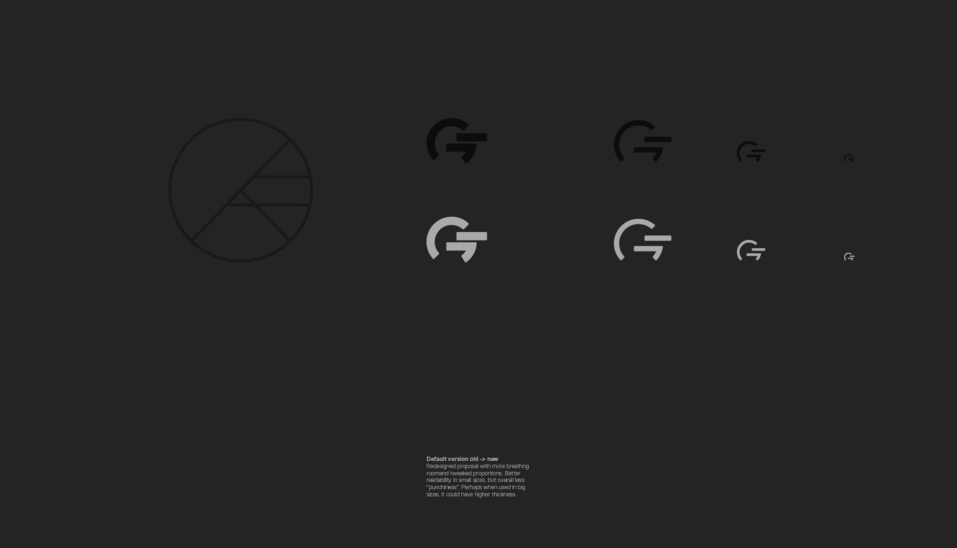
Further iterations were meant to explore the visual differences and optimise the simplicity of its shape, still considered a bit "tanky" at this stage.
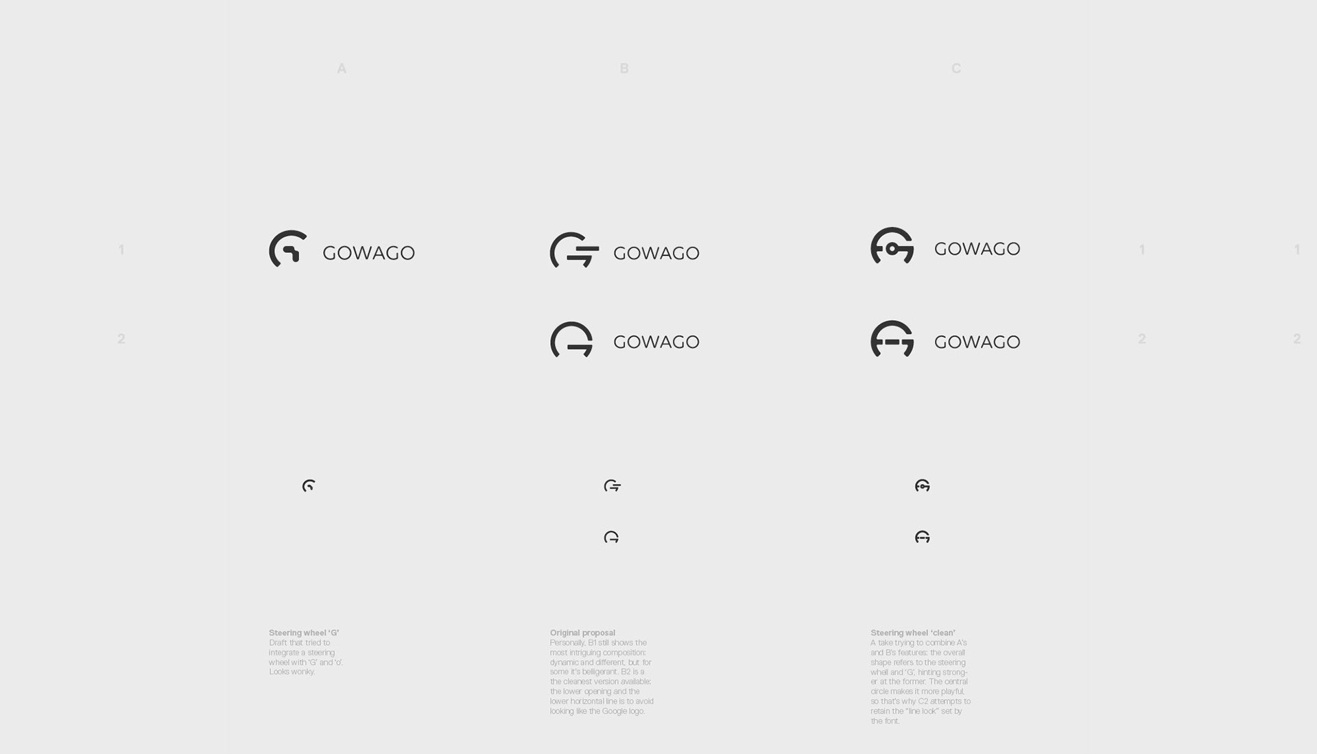
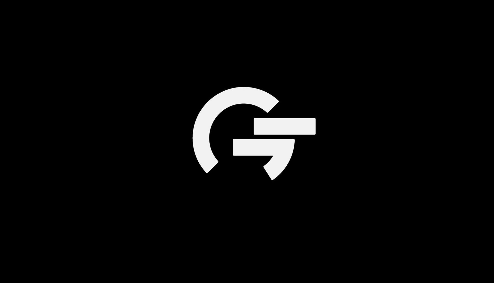
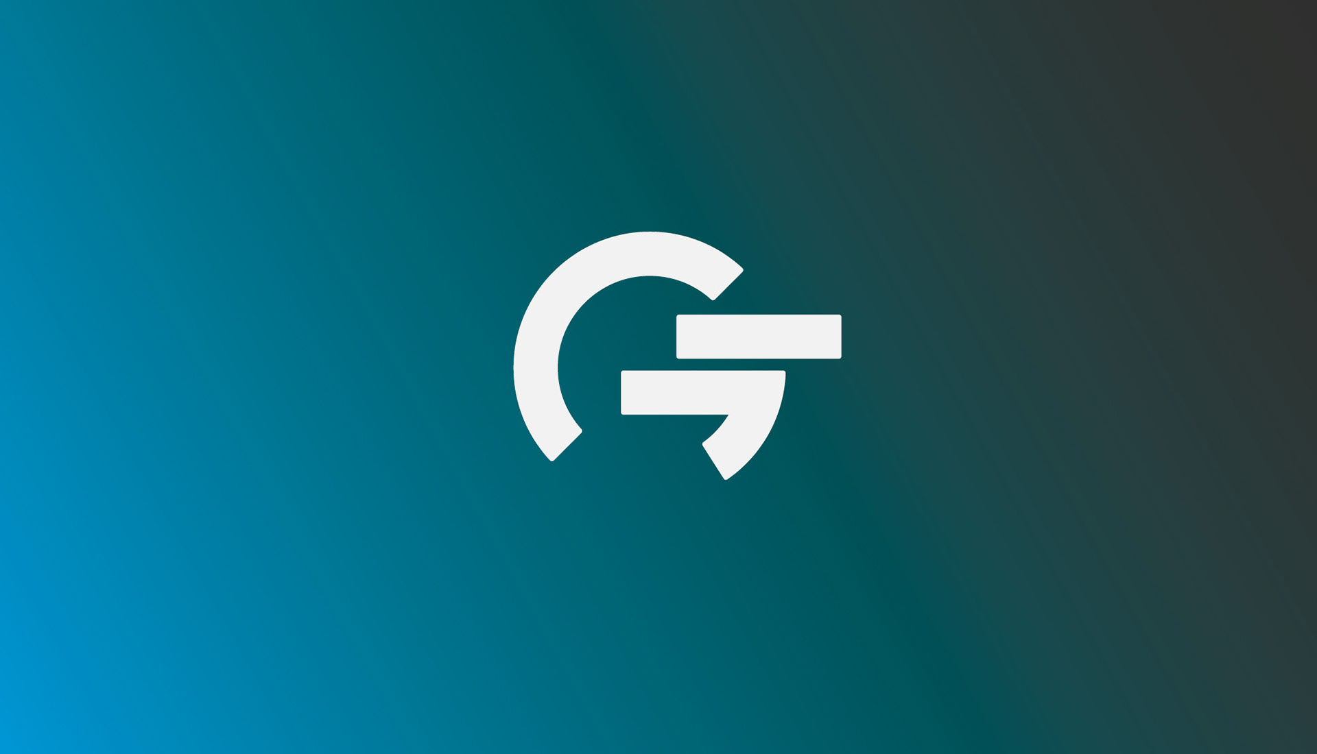
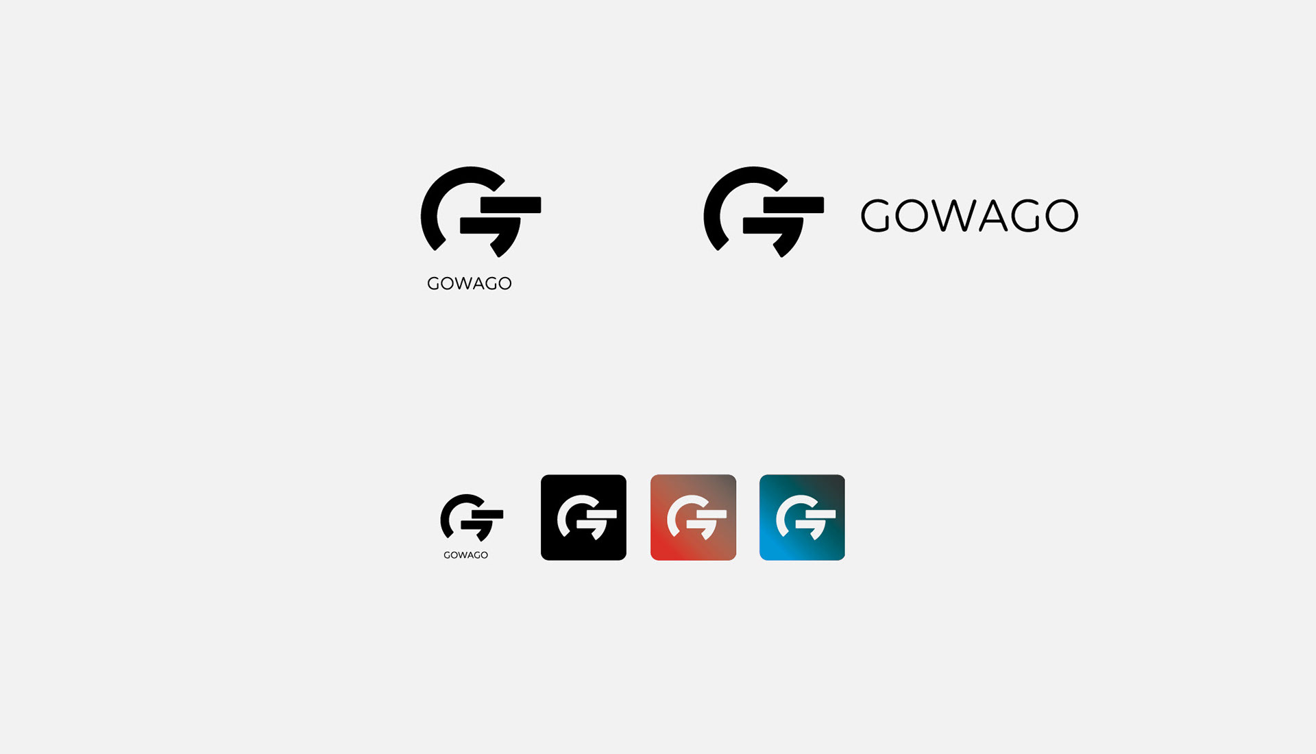
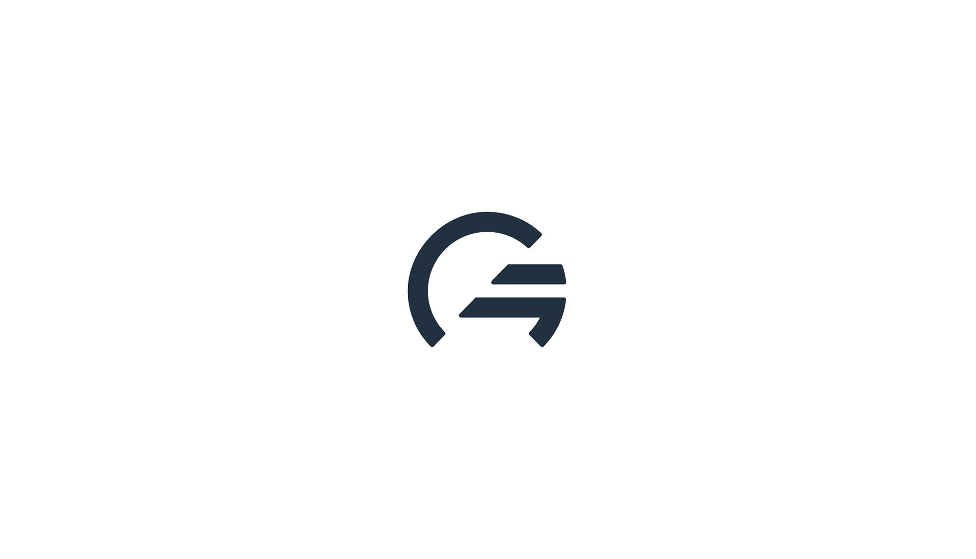
With the "main shape" defined, most polish on the design was focused on reducing complexity. The final version looks not very dissimilar to its initial stage, but comes with different tweaks in its structure. In addition to hinting to GOWAGO AG initials, a steering and car wheel, there is an additional image of a street exiting a tunnel.
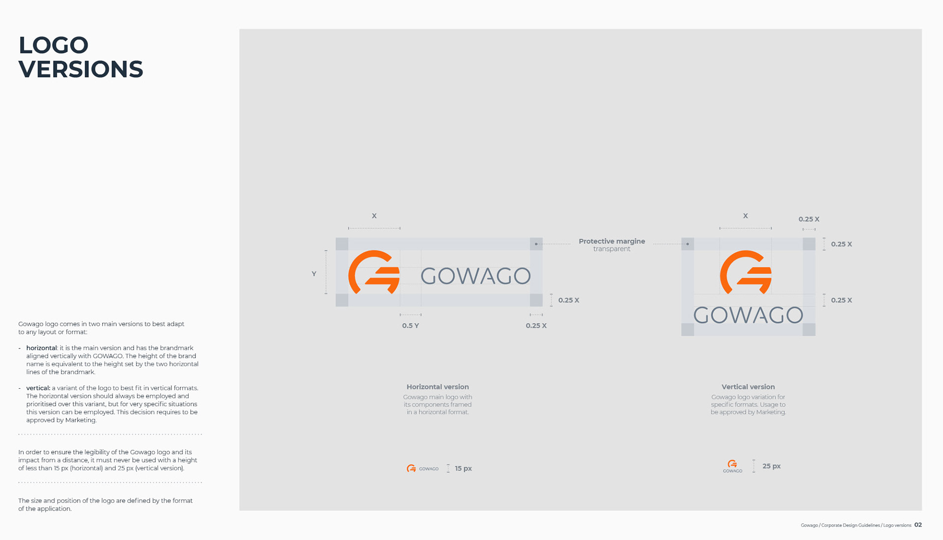
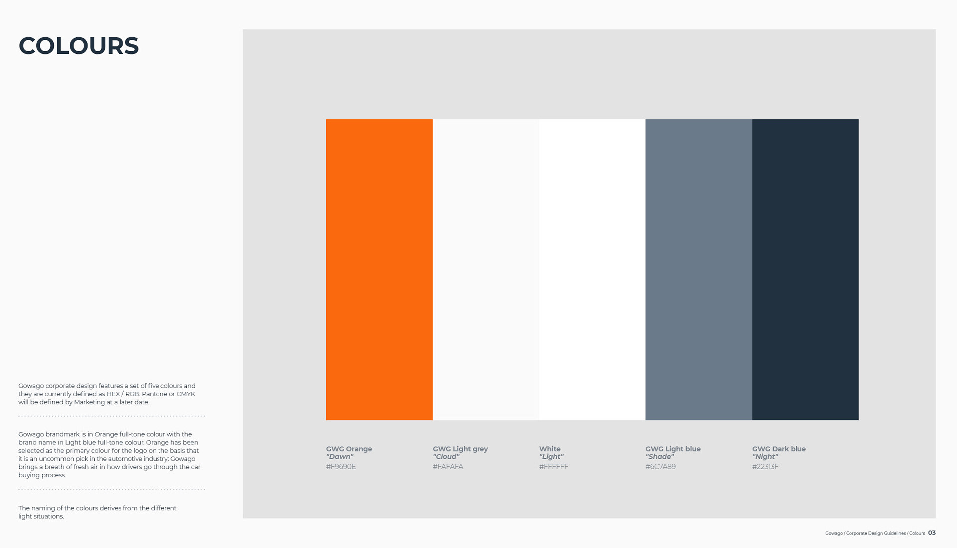
Volte Rounded Regular, used for the name in the logo, provide exterior curves close to being perfect circles. The font, sophisticated yet simple, matches the open structure of the brandmark. The colour palette is inspired from the light conditions from dawn to night.