Sky Aware and Autoflight are two new technology startups from ETH Zurich. The former provides small scale cameras for mobile robotics applications, while the latter offers swift payloads' deliveries through aerial robotics. The two young companies started by applying their technology on drones, and both needed a visual element to represent their products.
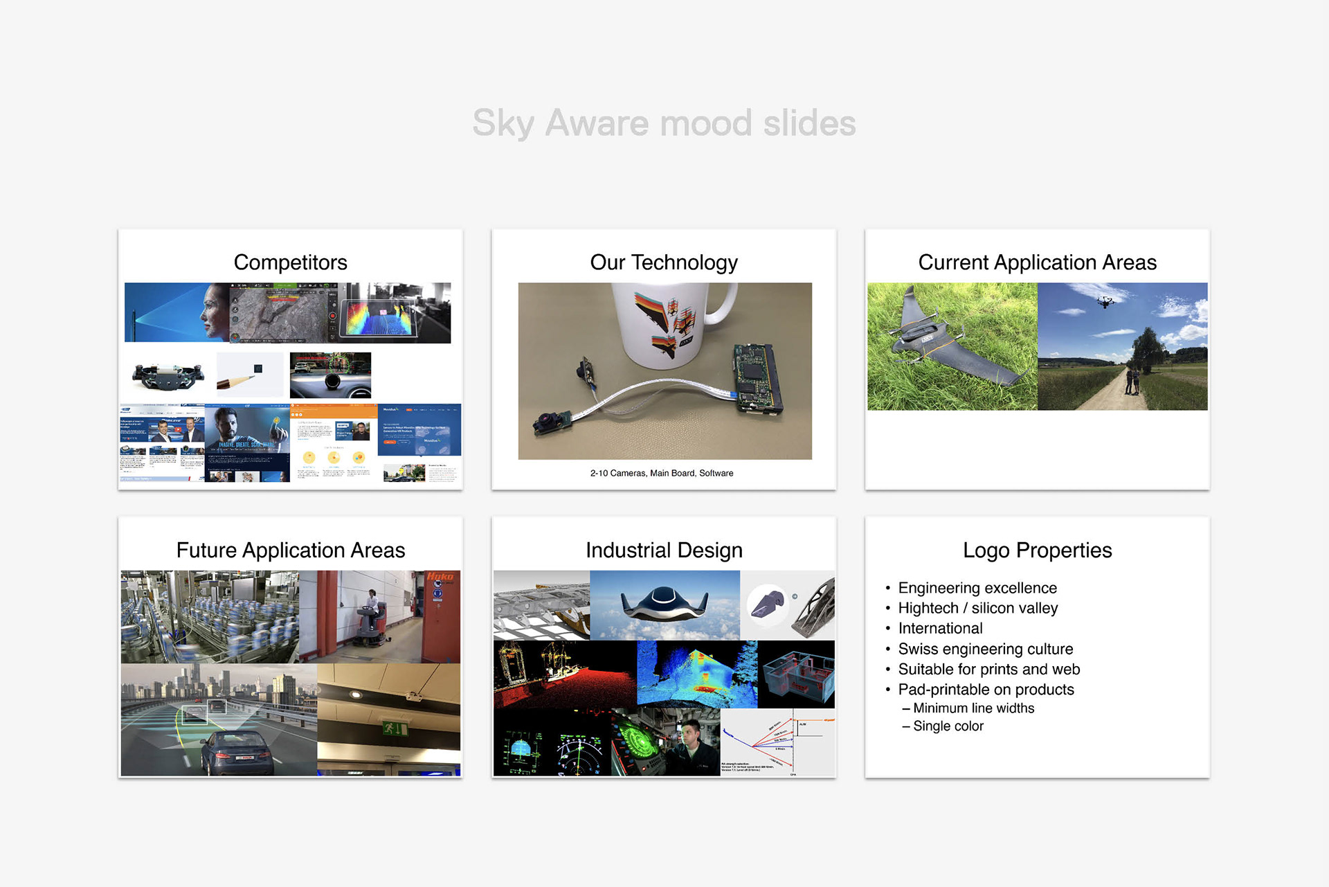
Sky Aware requested an "international", hightech, solid, product's logo for their technology. Three main concepts were developed around the camera sensor, the obstacle avoidance feature and an abstract take on the company's name.
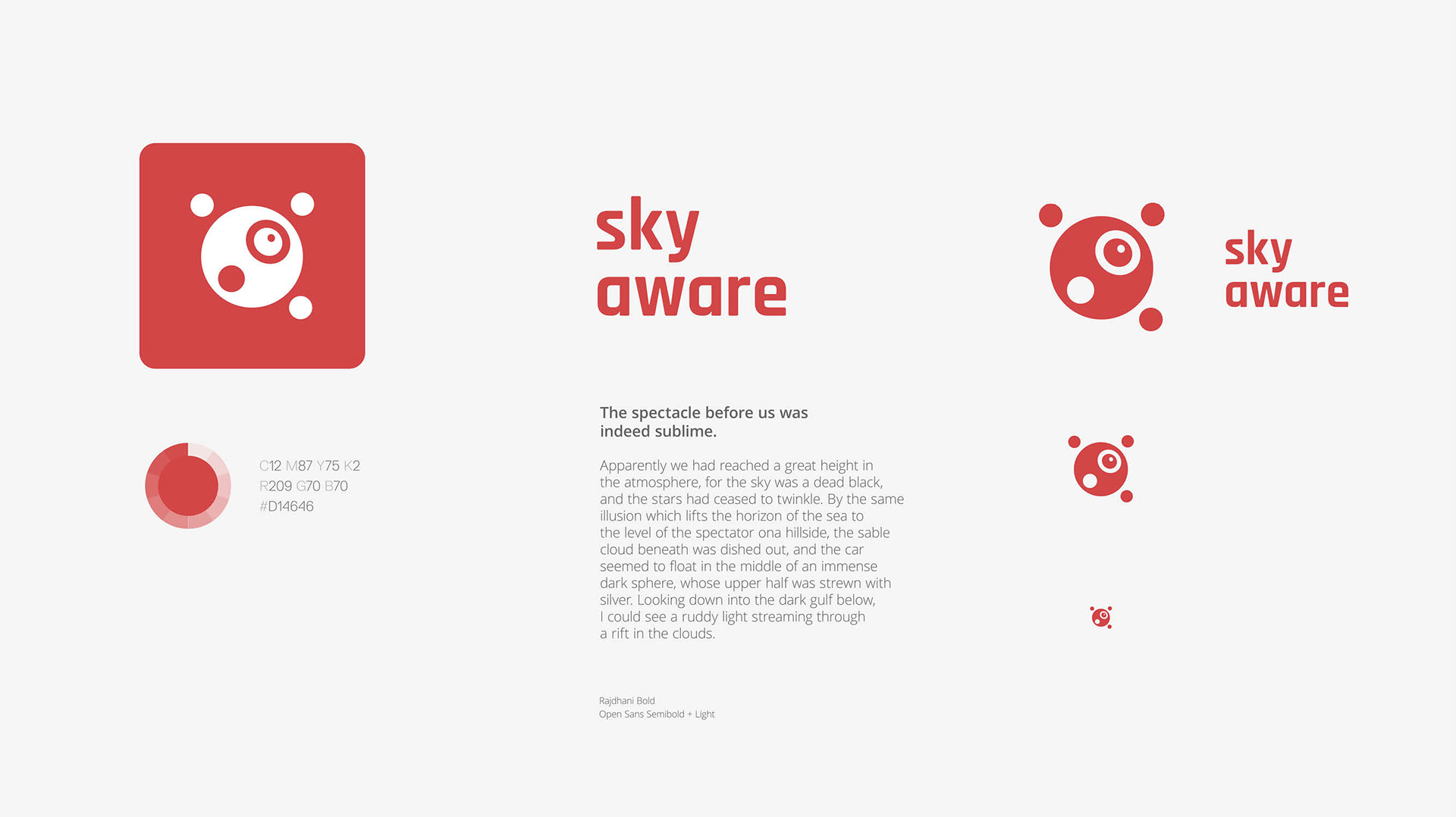
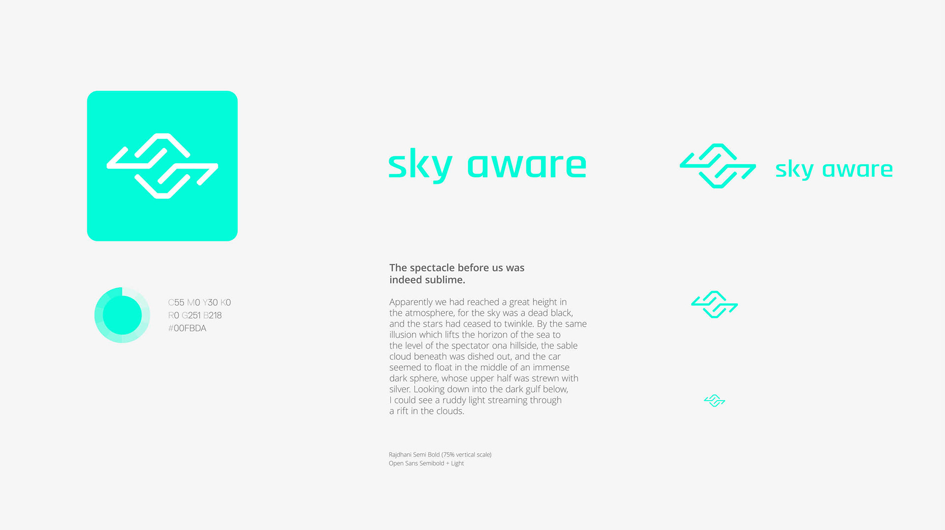
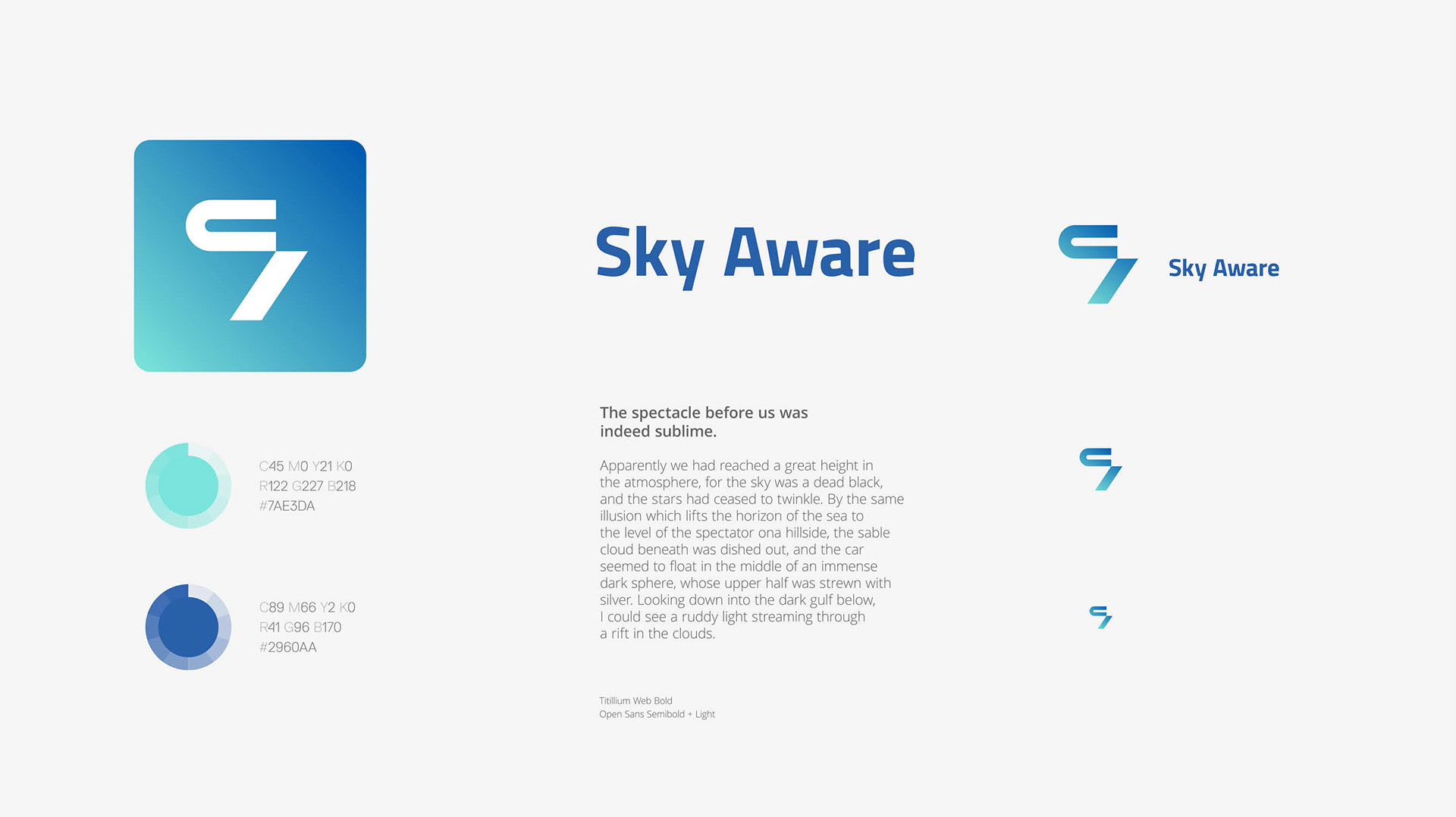
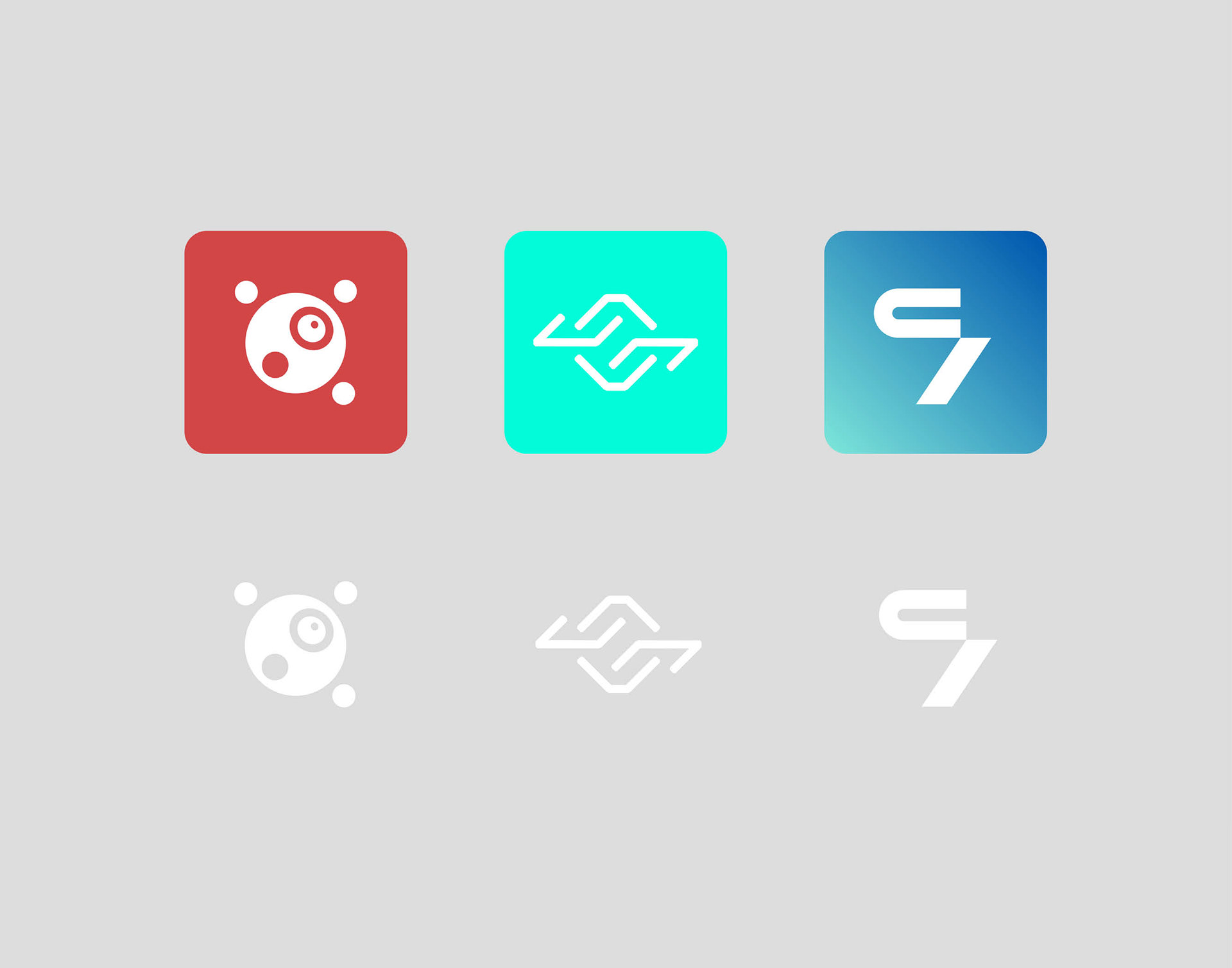

Option #A is all about the eye of the drone, the camera, and circles: the four "satellites" refer to the axis of movement (up, down, left, right). Option #B has circuit like lines that create the shape of a unit with directional vectors. The brightness of the tint stands for a fresh, young mentality. Option #C plays with the initials of the company and highlight sudden but precise movements. The founders picked Option #A and decided to keep the vectors.
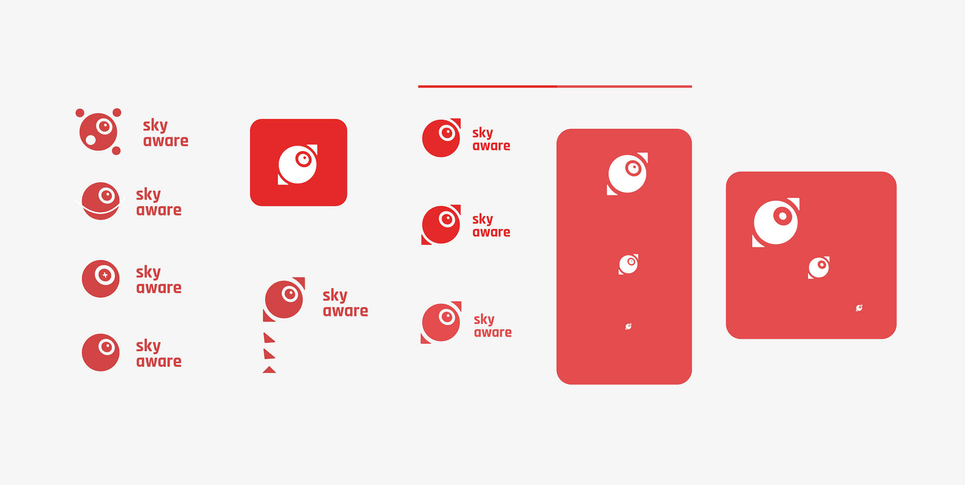
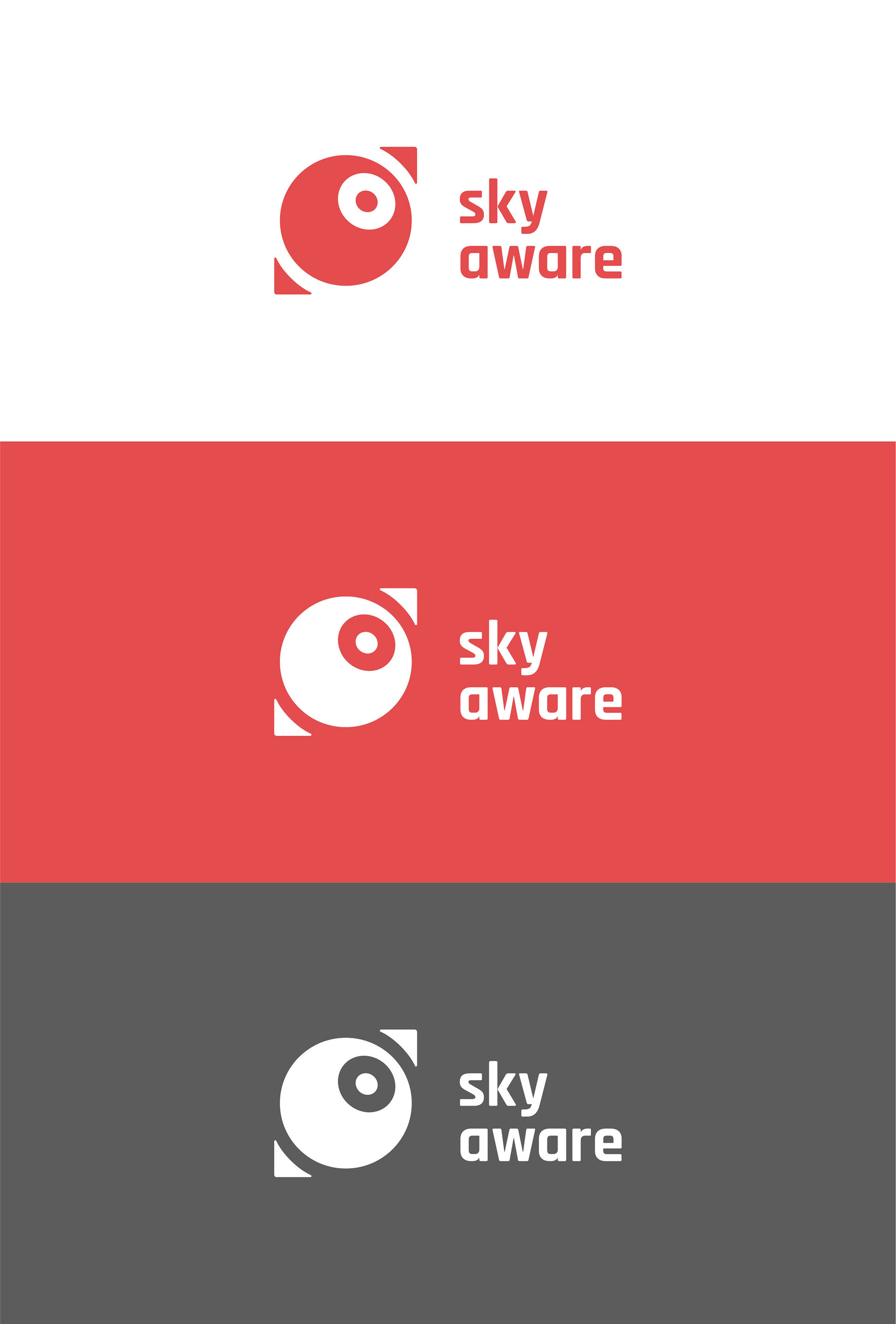
Option #A went through some feedback rounds with the final result featuring less circles and two directional vectors. The red tint is also softer on the eyes.
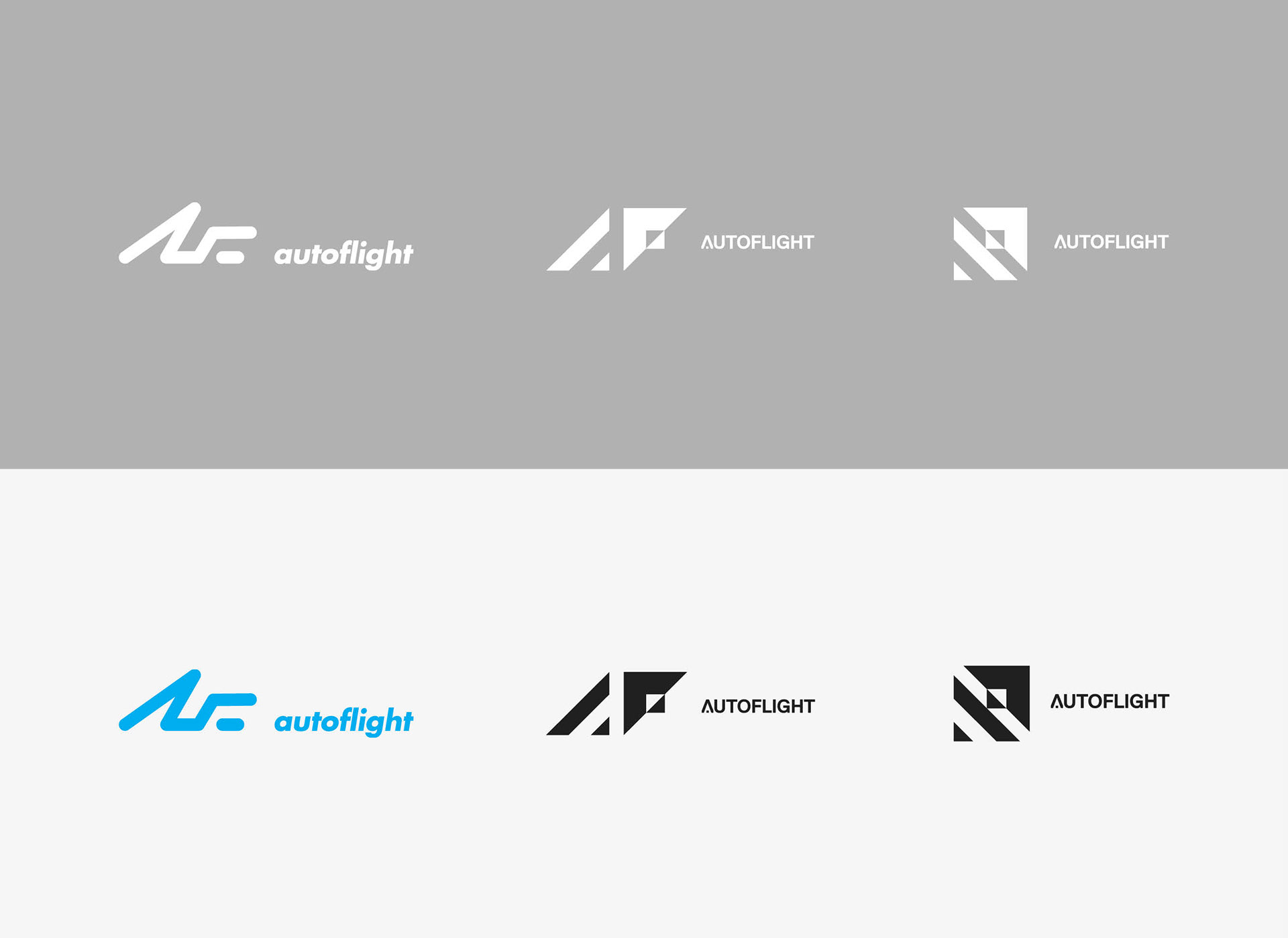
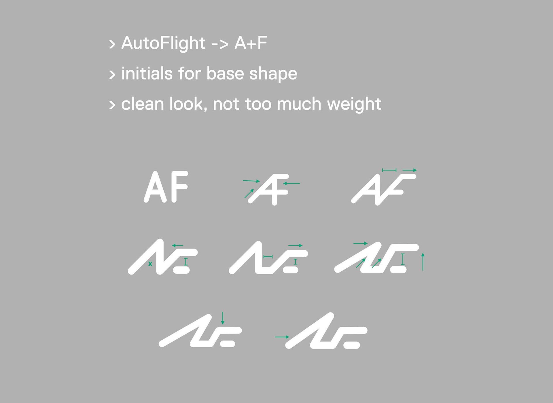
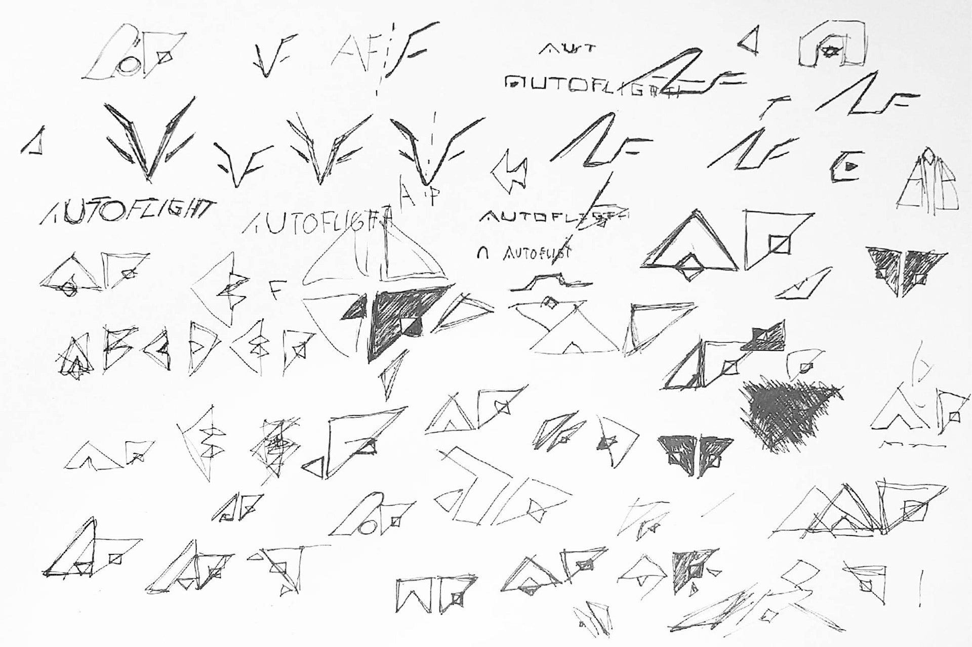
Autoflight's first concept revolved around a flexible rounded line that refers to the initials of the company's name and the profile of an UAV.

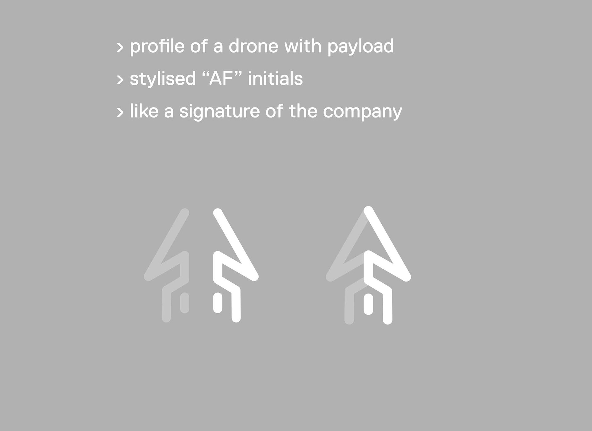
An additional variant was developed with the flexible rounded line concept. It featured a visual accent that would have been printed on the drone, but the overall idea was later axed when the visual result was less appealing than on paper.
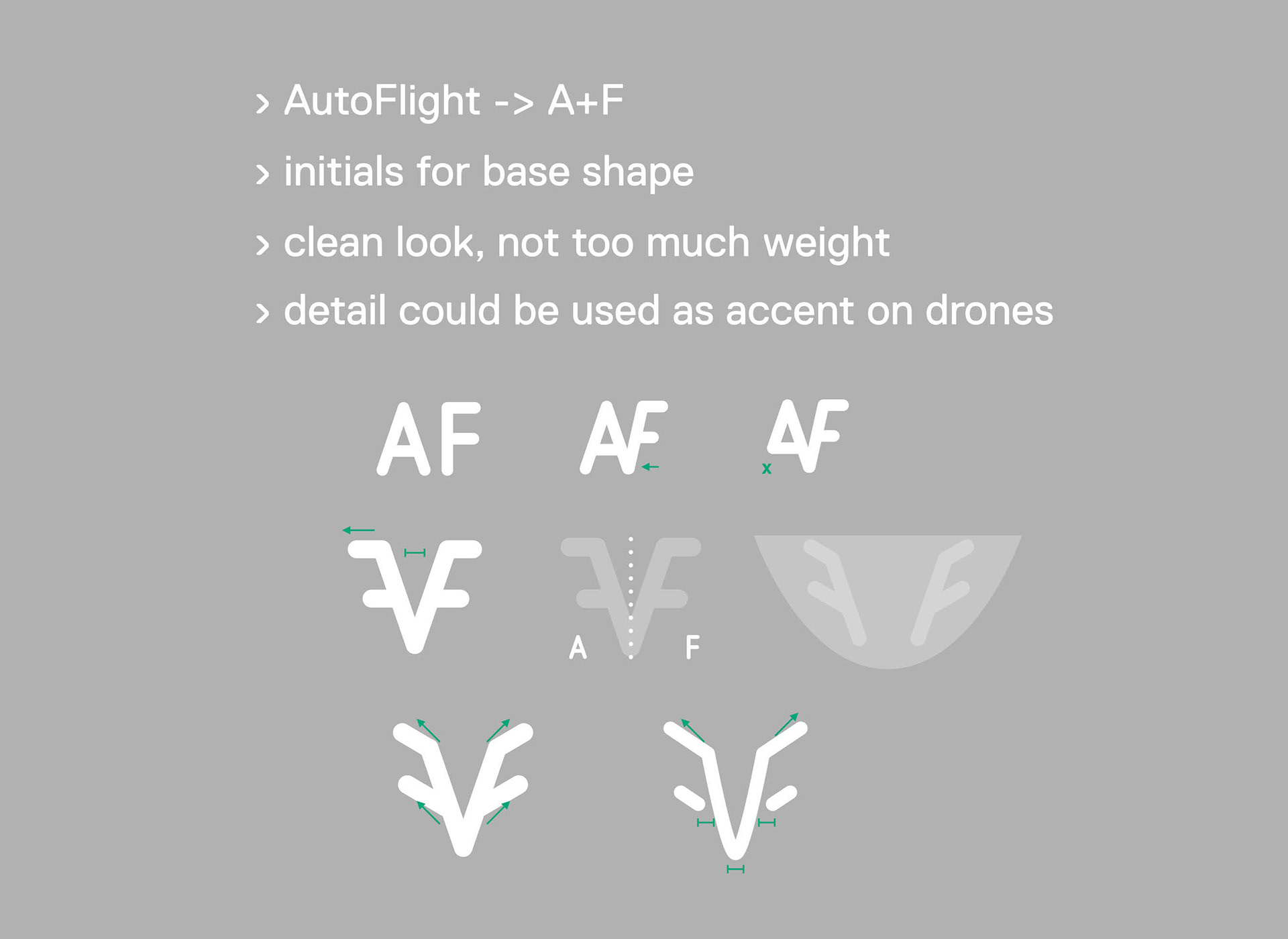
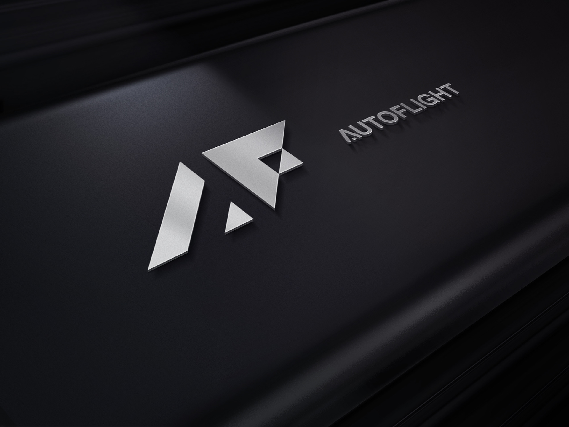
The second concept was inspired by the simplified silhouette of a drone reduced to triangles.
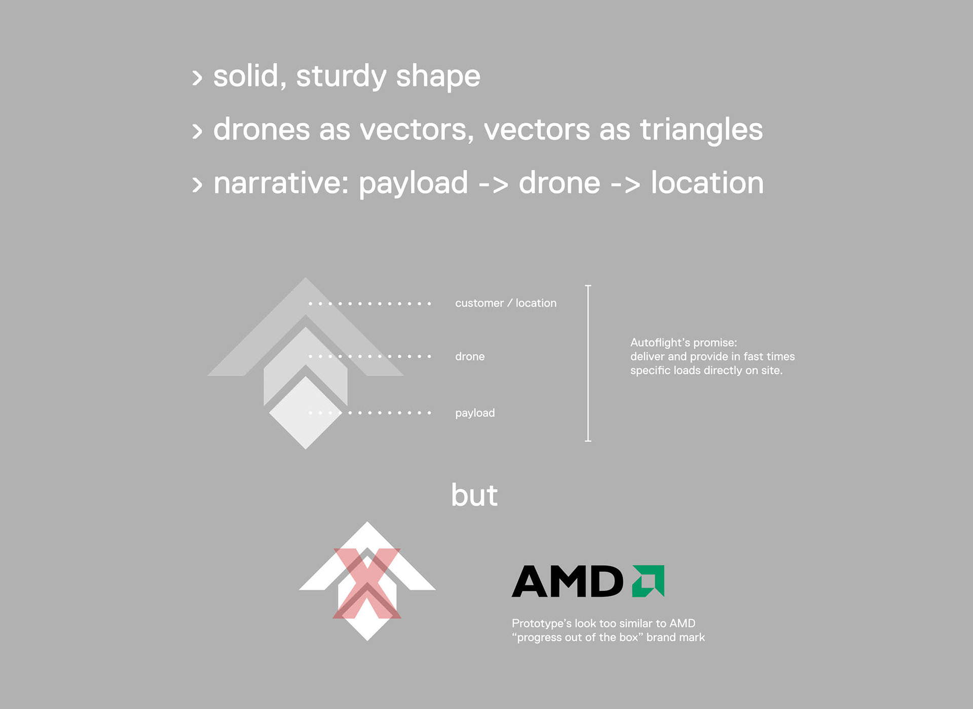
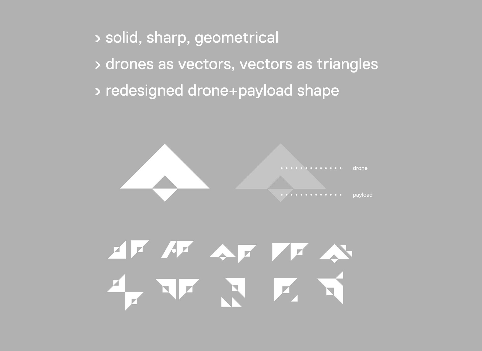
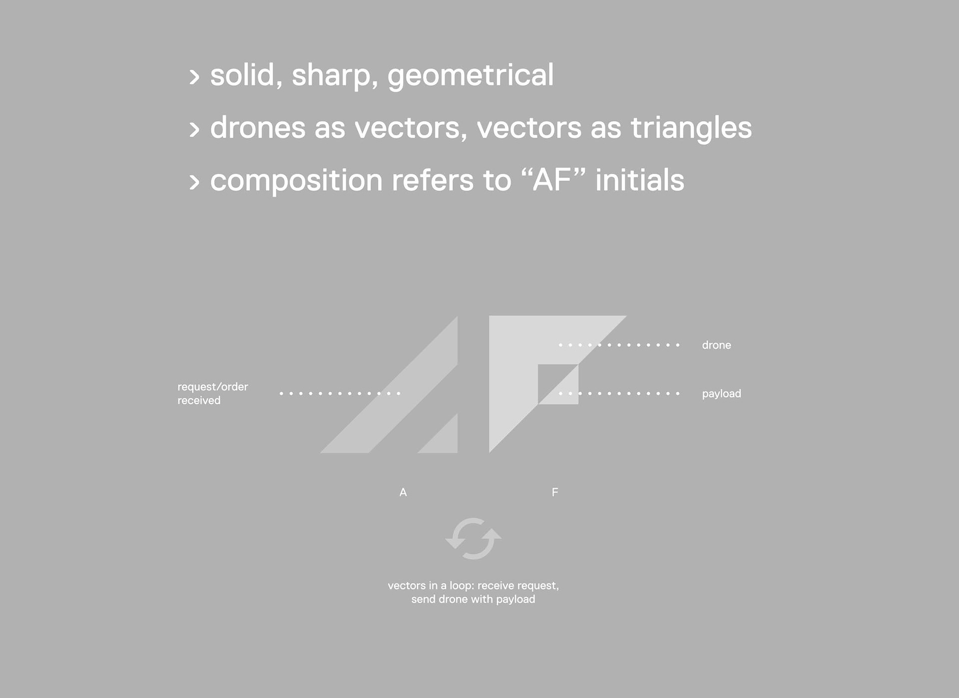
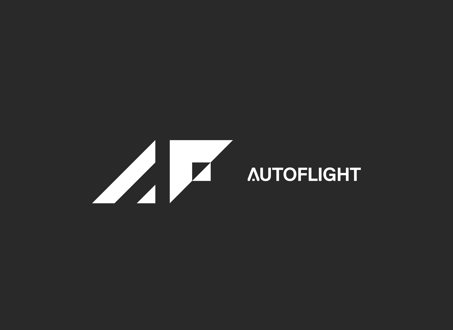
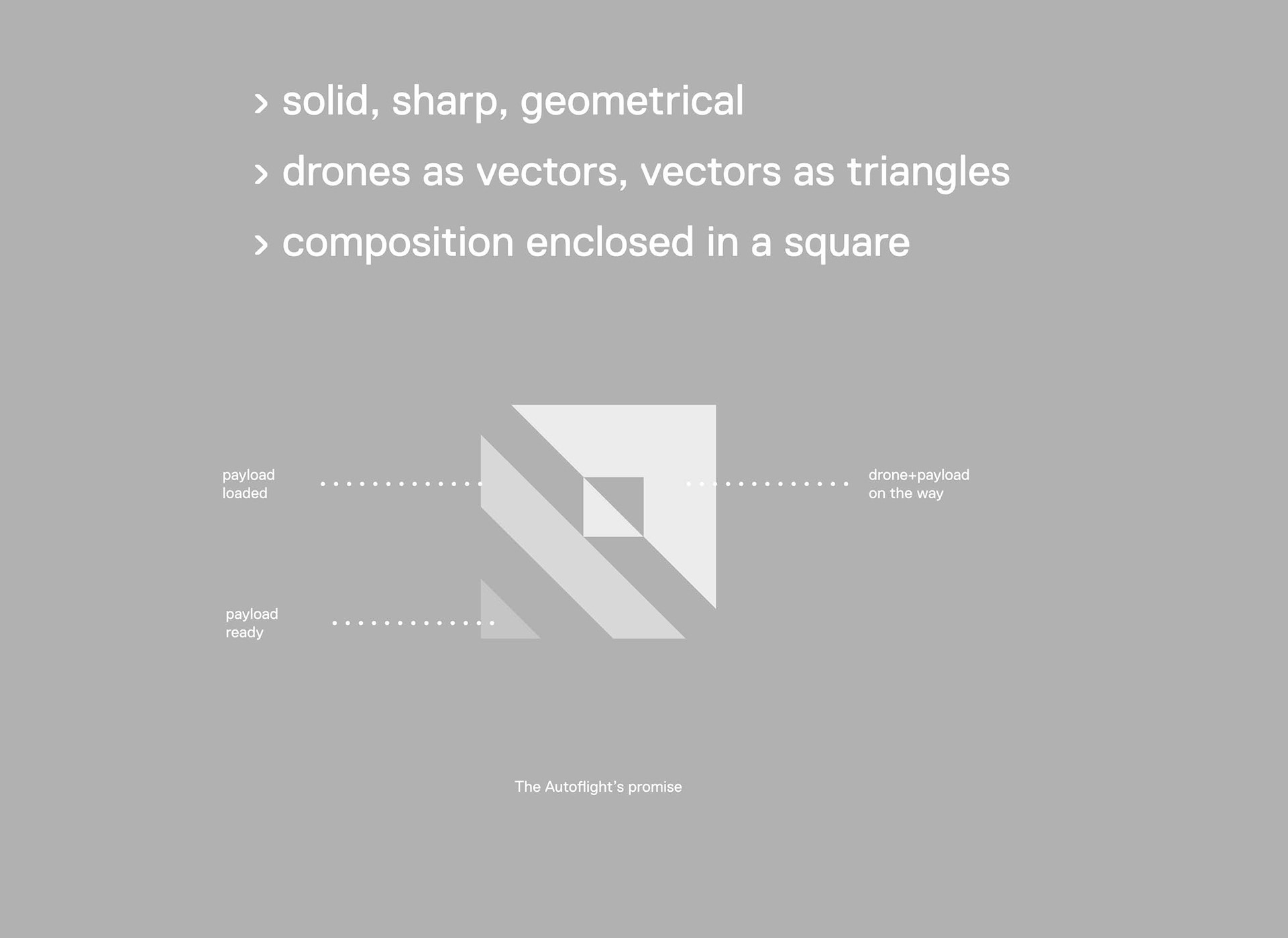
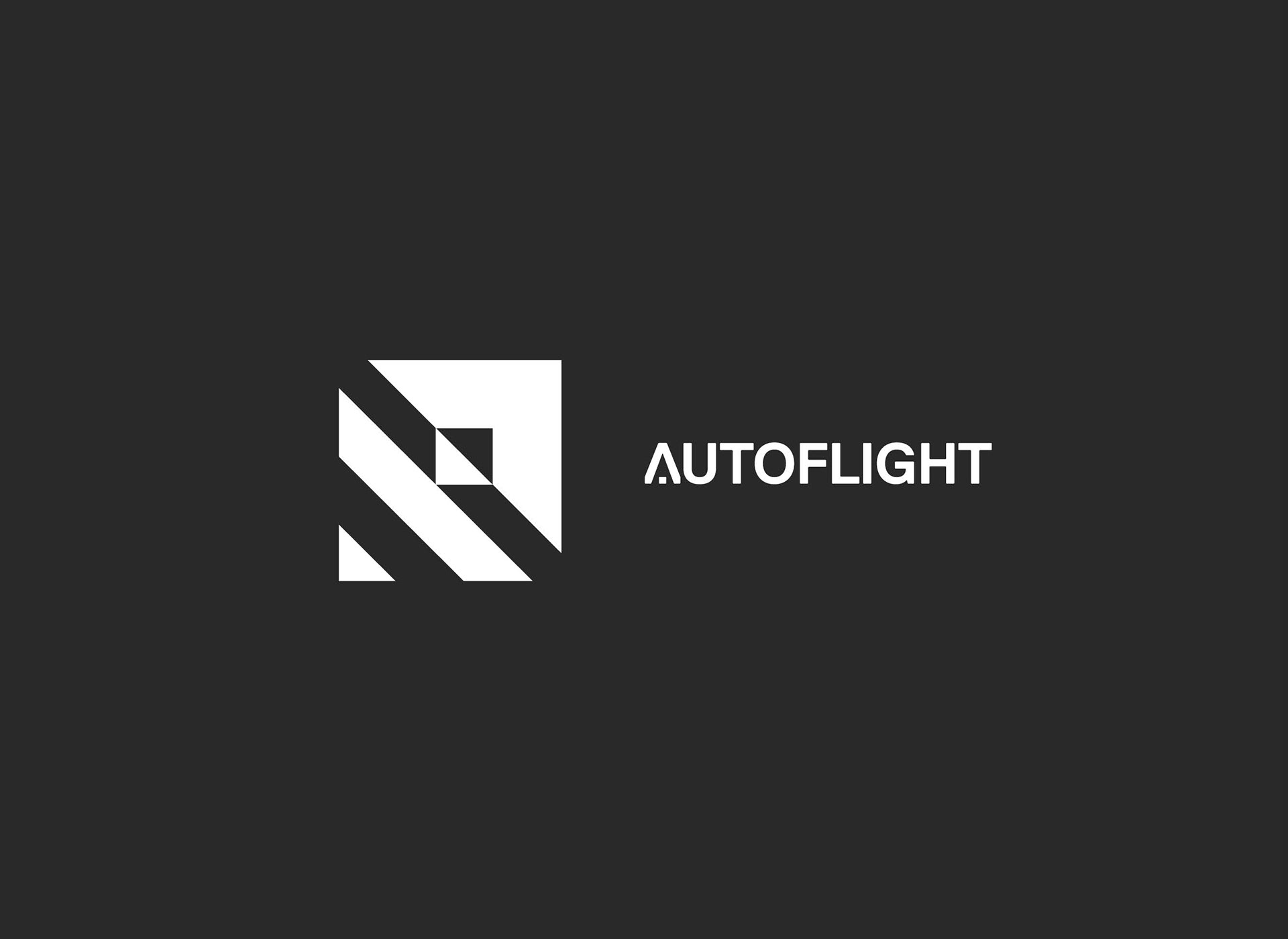
The "drones as vectors, vectors as triangles" versions were favoured over the stylised line logo.