Starmind, a young technology company with its roots at ETH Zurich, provides a self-learning software to big companies. With the expansion in the USA market at the start of 2015, Starmind committed to develop a new brand to accompany the international growth of the company.

Starmind applies self-learning algorithms to capture expertise, keep the information easily accessible and up to date. Employees have then instant access to relevant and clear answers without the burden of keeping records and updating old document versions.

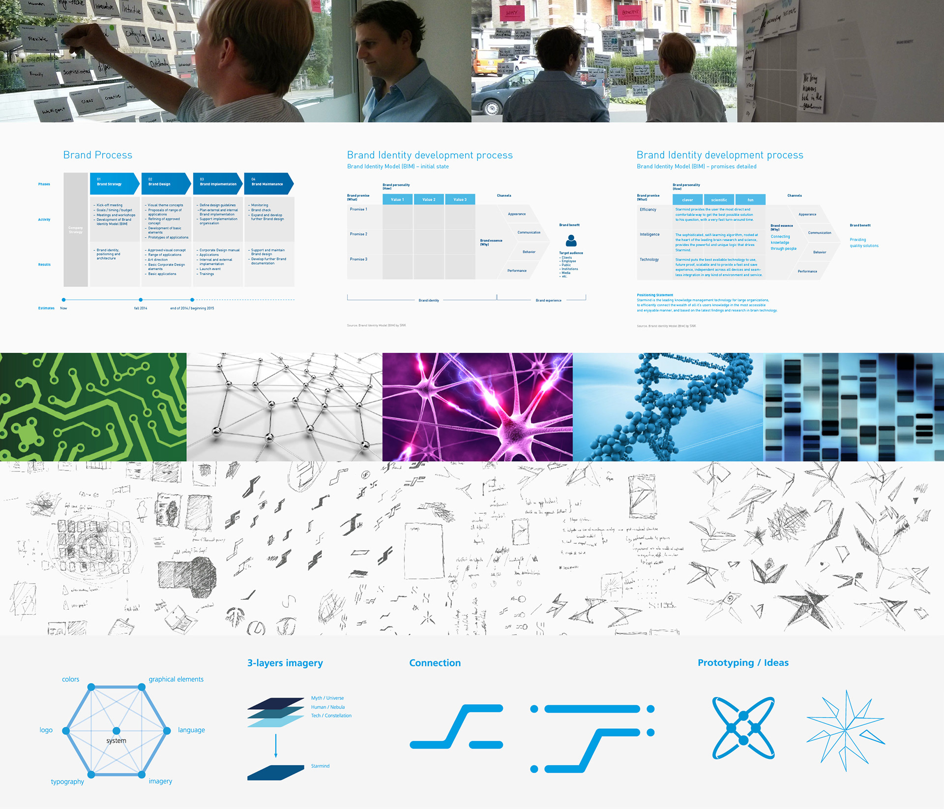
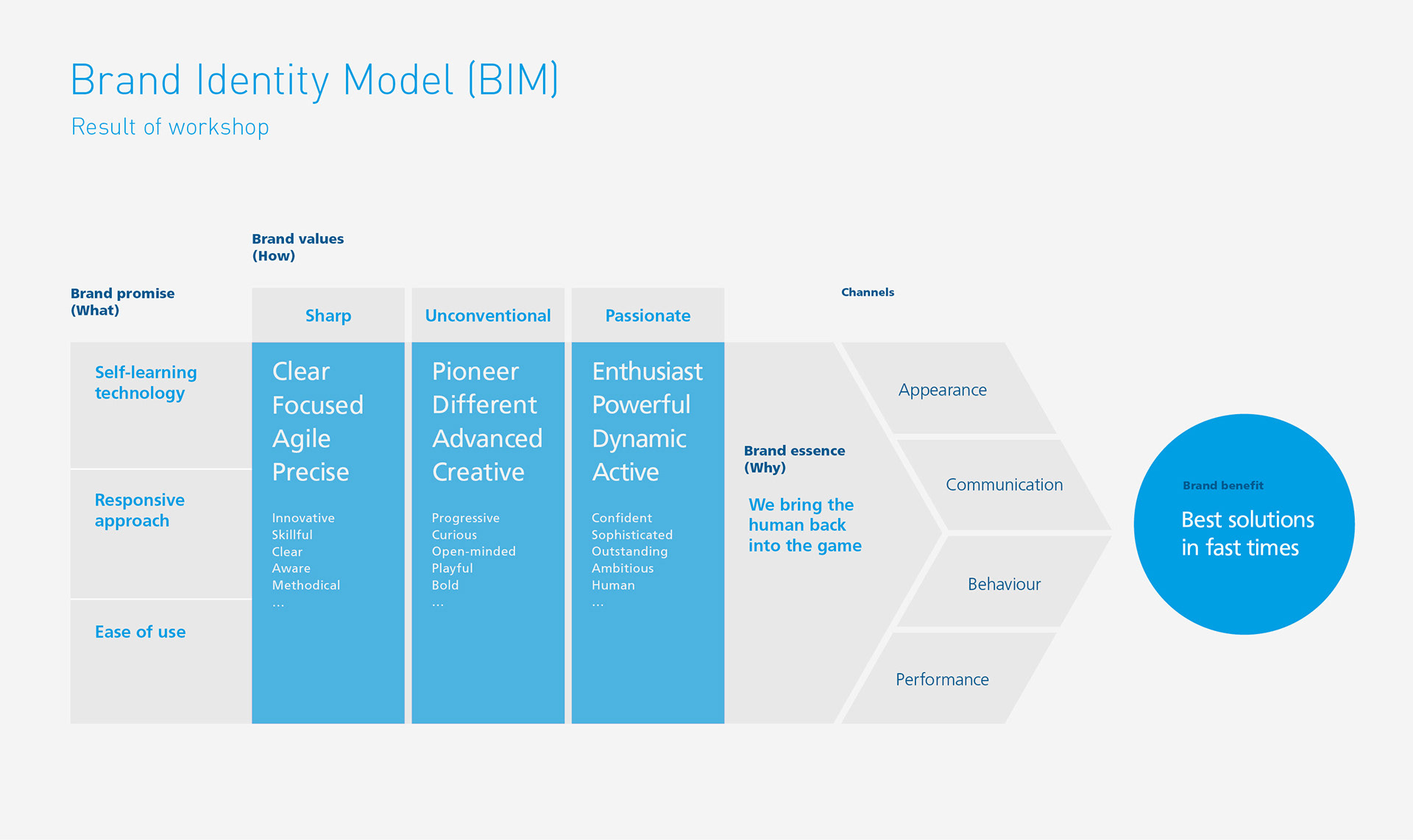
The brand identity of Starmind originated from the company founders’ curiosity for robotics, AI and neuroscience, with the vision to "think with the power of 1'000 brains in the pocket". Starmind's brand principles were built on the five main pillars of the Brand Identity Model (BIM), which provided a summary of the identity and personality of the company.
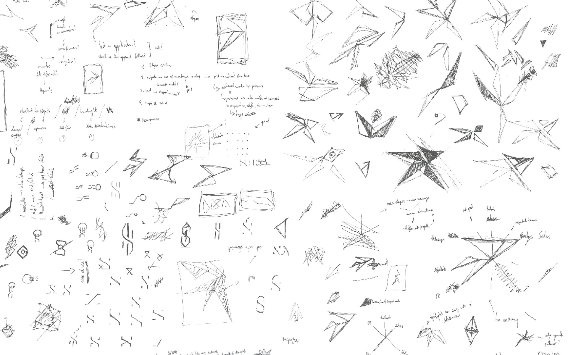
Following the results of the BIM, the visual identity present at the time was deemed unfit: it didn't reflect the established brand principles and was already incoherent. Design of the new brand started with development of the basic elements and a specific vision for the imagery.


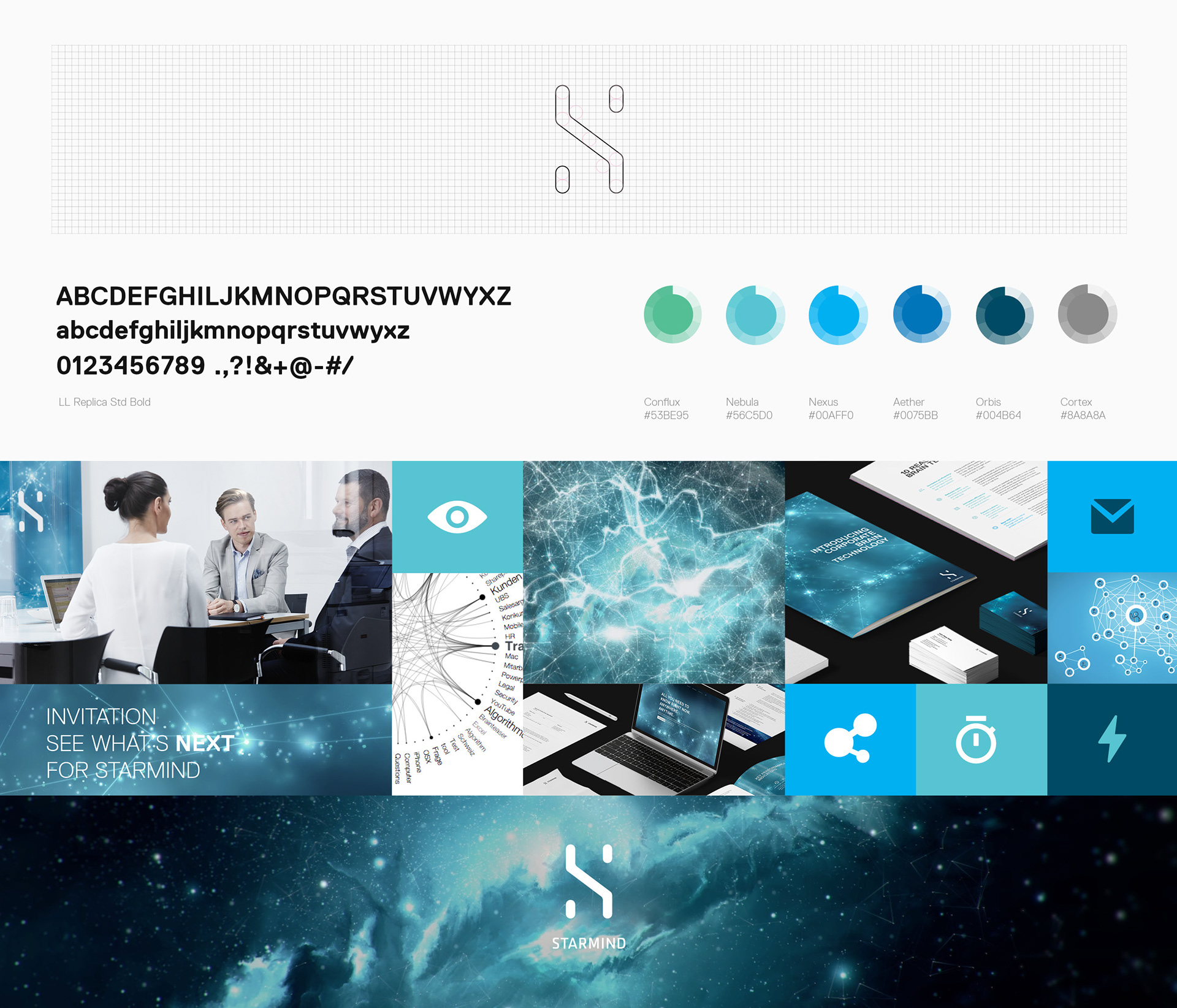
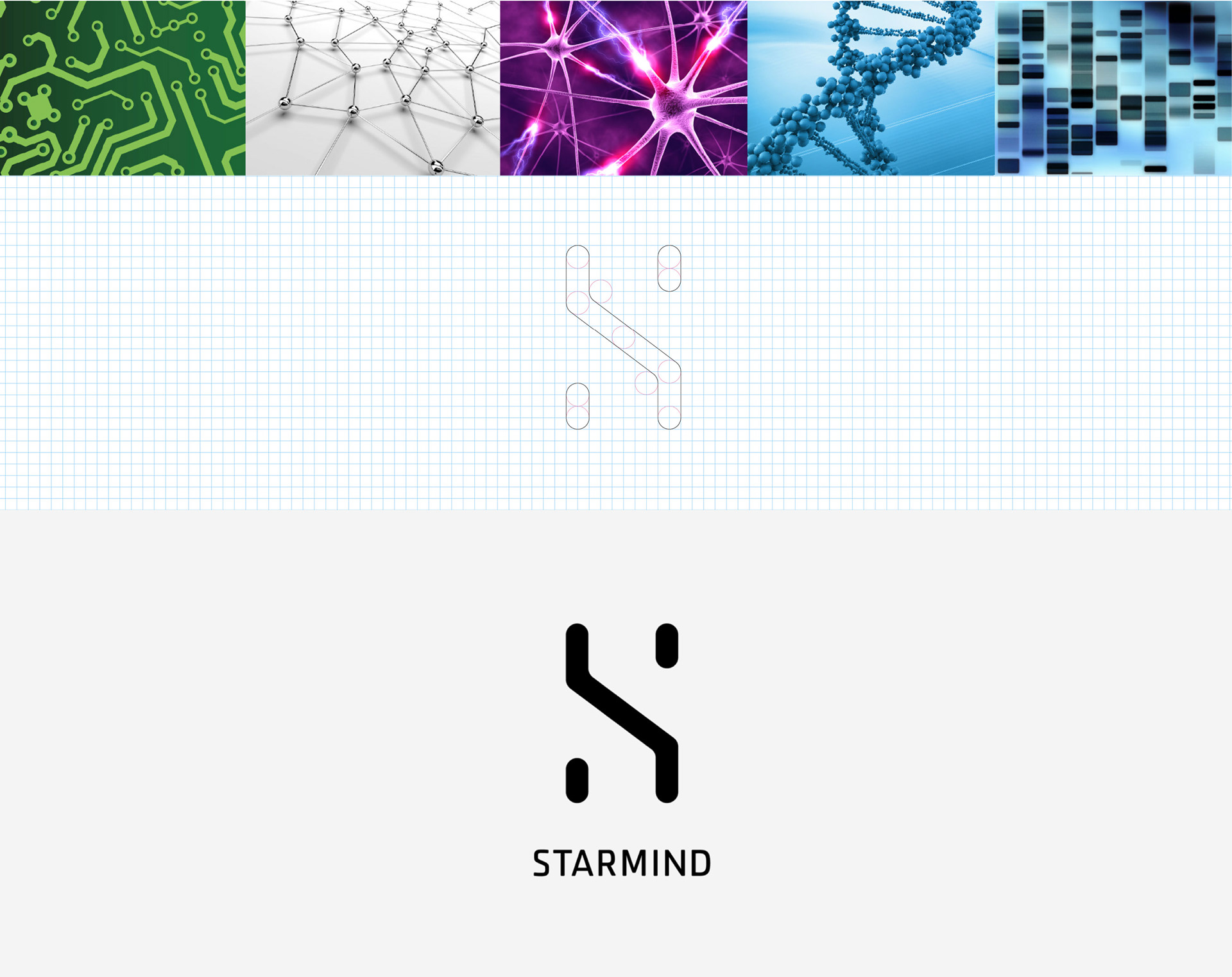
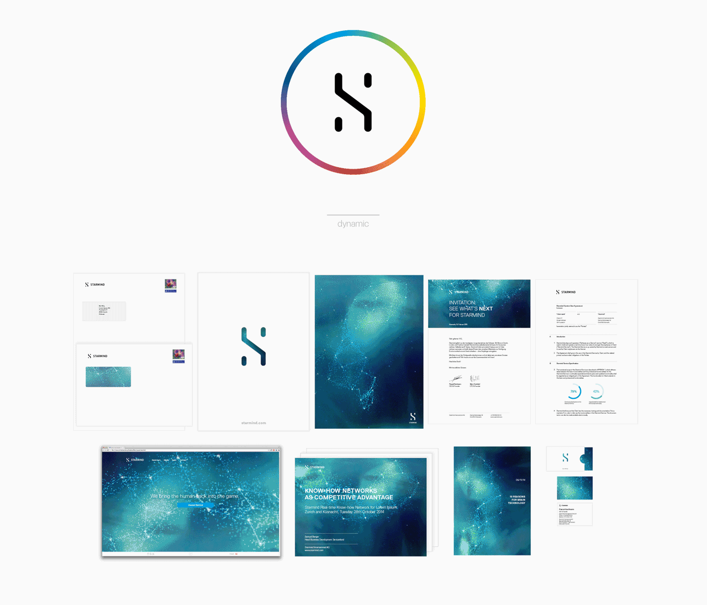
The circuit boards refers to the technological prowess, the connectivity between node mirrors how neurons react in our brain, and ultimately how the Starmind application operates. Starmind empowers the user, the human element represented by the DNA. The Starmind logo has a technological vibe and a human touch: it's connected, simple, with a hint of sci-fi. The brandmark also echoes the shape of the capital letter "S".
The corporate typeface of Starmind, LL ReplicaStd, is applied for all applications, marketing collaterals, documents, presentations, with the exception for drafts. LL ReplicaStd distinguishes itself for a very high readability within an unconventional and sharp grid, qualities that reflect the principles of the Starmind brand.

Conception of the key visuals started with switching the spotlight from the brain, considered unappealing, to the organic nature of a Starmind network. The final art direction of the key visuals, internally dubbed as "Starmind galaxy", refers to the actual company name and portrays how know-how is interconnected like individual brain cells that have a structure of connections like stars in the universe.

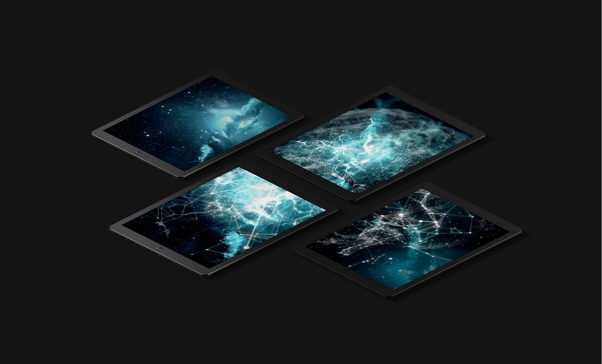
A 3D model was later developed in collaboration with Monkey Talkie to bring to life the Starmind galaxy. Edited videos of the 3D model were extensively used on displays in the offices, at fair booths and integrated into Keynote presentations.
To strengthen the human touch of the brand, a collaboration with the photographer Mara Truog was arranged to portray stories of "starminds", subjects with an aura of "ready to act, know what to do next". Shadows and reflections have been used to reinforce the open and technological environment of Starmind. All pictures were shot in the Zurich main offices.


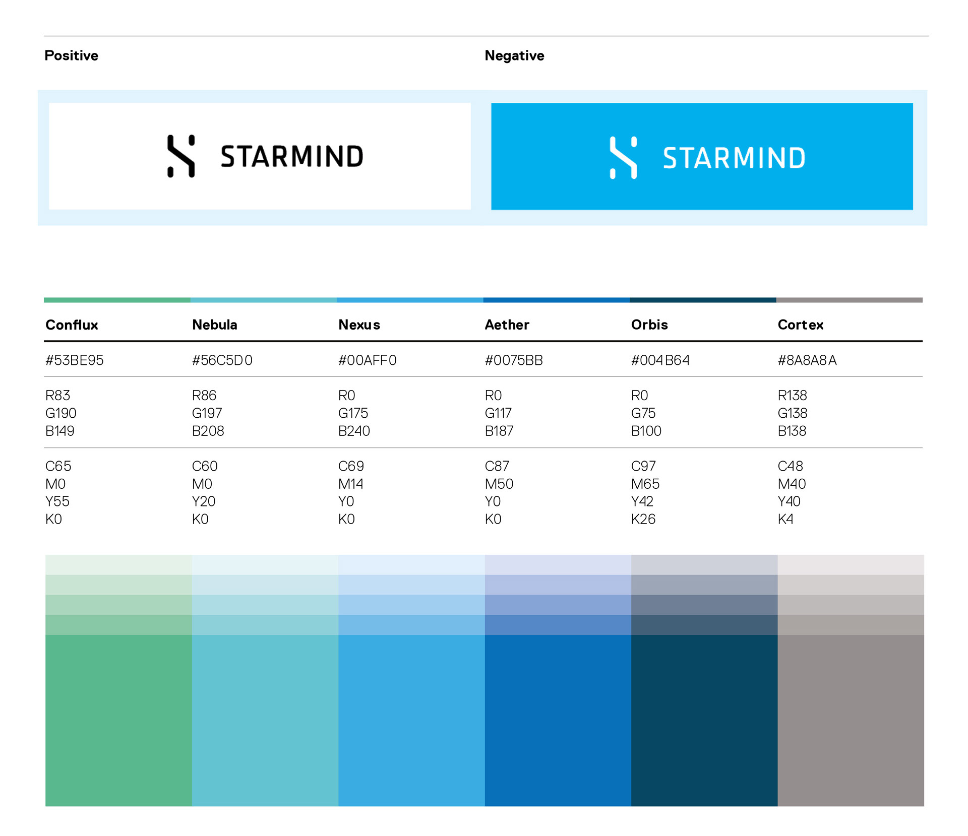
The Starmind logo is used in black on white background for all documents, in white on a saturated colour or over an image. The "default" colour palette describes the rising view from the ground to the sky as it turns into space. "Cortex" is a reminder of the neuroscience background.
Additionally, the brand was designed to be dynamic, with key visuals generated from the galaxy 3D model able to change colour, shape and arrangement over time. Goal of the dynamic brand was to highlight the “doing things in a clever way” mindset, the young and cool attitude, and the technical skill of Starmind. The concept was rejected to not alienate the stakeholders.
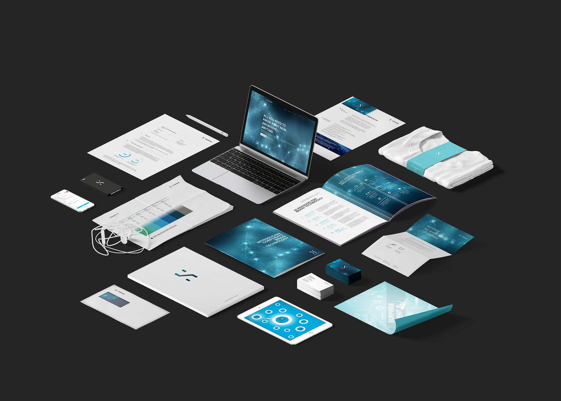
The international positioning was accompanied by the new brand together with a new website and a dedicated press release. Because of the simultaneous release and tight schedule, production of the website was done in 3 weeks with the help of Factory Design Labs implementing the design. The new portal was designed as a mobile first product's website to inform and advertise the latest version of the Starmind application.
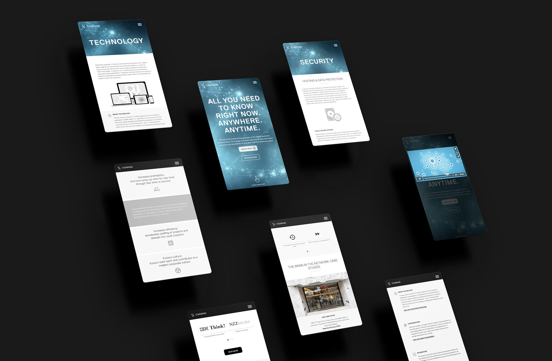
To help potential customers better understand the product and get more in touch with the brand, a series of 2D animation videos were produced with videodesign.ch. The art direction is essential and fluid, with smooth transitions from scene to scene and visuals that reinforce the organic nature of the Starmind networks. The narrative revolves around the the stress of the main character and how Starmind is illustrated to be the best solution.
In early 2016, starmind.com was redesigned employing Squarespace to have complete flexibility in editing the content and revamp the blog & press areas for a more incisive marketing campaign. The overall tone is friendlier and there is more about the team.

Instead of compiling a typical PDF bible, all brand guidelines are stored and updated on the Frontify Style Guide platform to allow a quick and agile use.

With development starting in Summer 2014 and the unveil in February 2015, the brand of Starmind achieved an overall positive reception above expectations. Brand management and design duties remain within the Marketing department.