In 2011 Tinext, a Swiss ICT company with offices in Lugano and Milan, celebrated 10 years in the business. For the occasion, an update to the brand design was proposed and implemented.
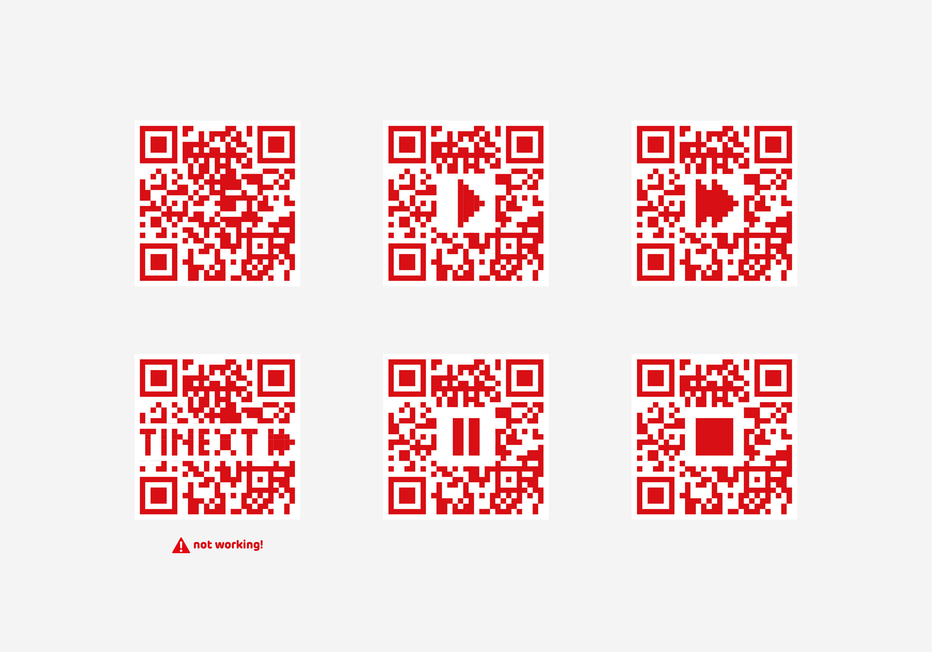
The BoD requested an update based on the visual elements already in place. In the end, only the logo and the corporate colours were retained. A pixelated art of the brandmark and a specific use of the AV icons (play, pause, fast forward and stop) acted as springboards for the rebranding process.
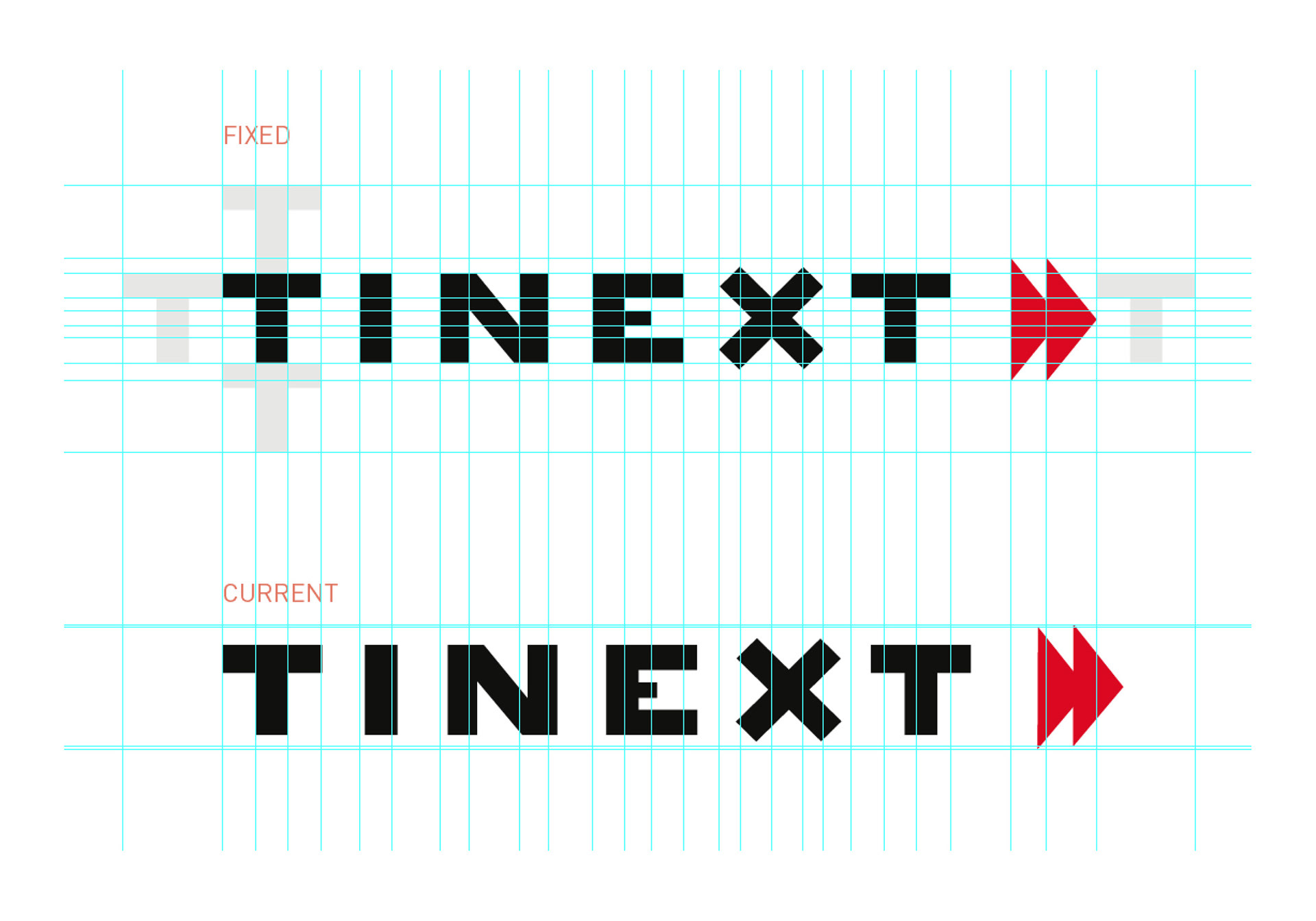
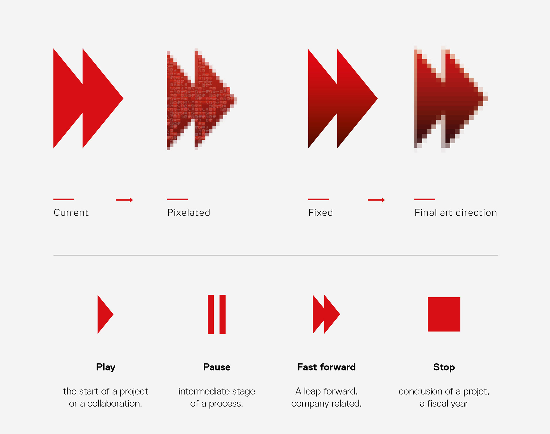
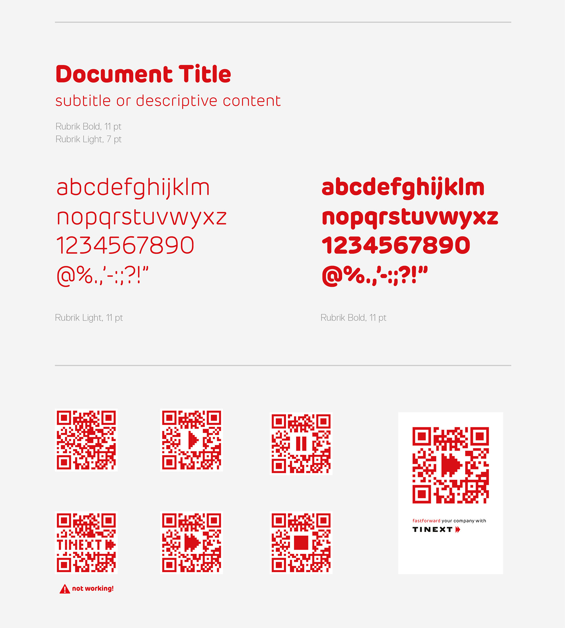
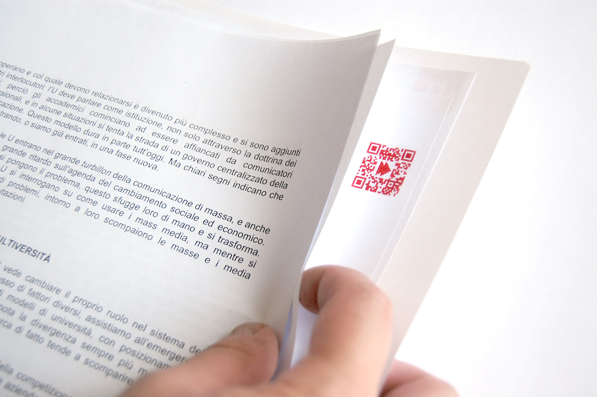
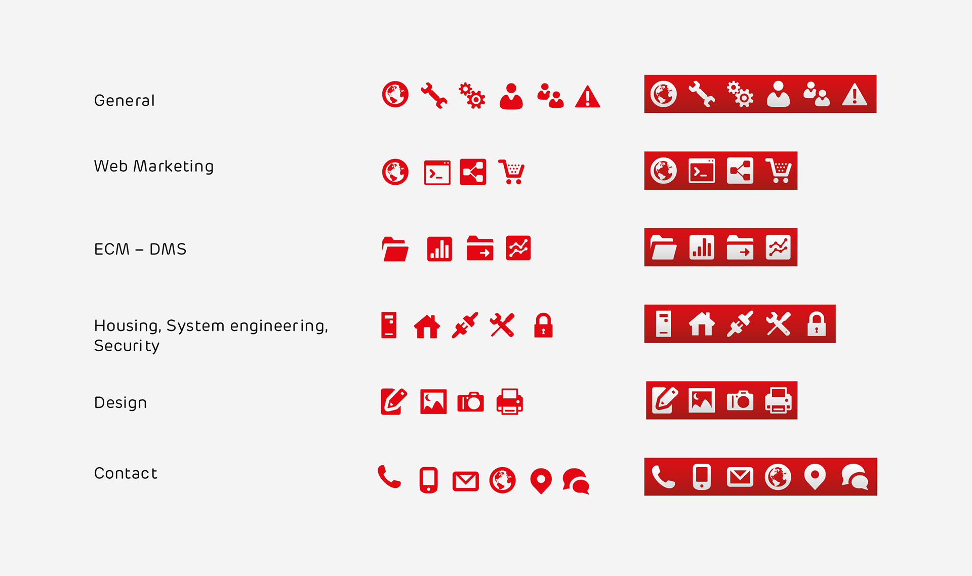
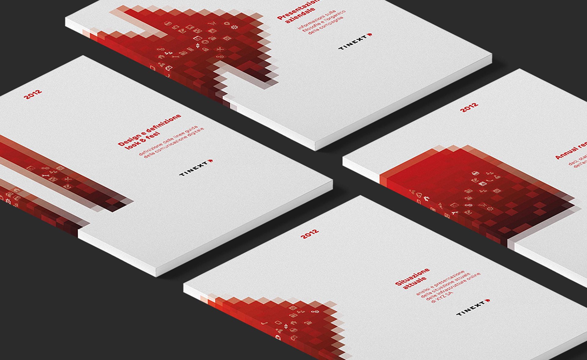
The refreshed visual identity comprises the pixelated treatment, that refers to the digital domain, with the Rubrik typeface, a softer technological font, paired with a rounded icon set. The key visuals expand on the brandmark's motif (play, pause, fast forward and stop), with each AV icon used for a specific range of content. The icons make the key visuals pop and tell a subtle narrative. The QR codes were developed to bridge the offline and online spheres, but the concept was altogether dropped.